# UX Design
Bio Informatics
Data Management
User Experience
SaaS (B2B)
0-1
Web
Overview
CLIENT
A world-leading hospital that dedicated to clinical practice, education, and research.
DESIGN OBJECTIVE
This project is for supporting the internal genomics research.
METHODS
Prototyping (low-fi, mid-fi, hi-fi)
Usability testing
Sprint management
TOOL
Figma
Miro / physical whiteboards
Azure DevOps
TIMELINE
Phase 1: Jan 2022 - Dec 2022, 20% FTE
Phase 2: Jan 2023 - Jan 2024, 30% FTE
Phase 3: Jan 2024 - Mar 2024, using my own spare time
MY ROLE
Phase 1: Assistant UX designer
Phase 2: Lead UX designer, observer and note taker for usability tests
Phase 3: Lead UX designer
Project Context
This is a 0-1 project that aims to uncover and explore meaningful research questions through active data observations.
It supports the first few steps among the complex process of data investigation:
Prepare the object (data) of study
Query across datasets (for research users, allow them to compile a query more flexibly; for novice users, provide them modularized choices and explanations)
Manage the queries, and see the query progress
Save reusable query assets
Explore research direction
Browse the gathered (queried) data then send it to the next step in another platform
Users
Phase 1
I was the creator of several components and contributed ideas in the brainstorming
Design 1
Challenge Statement
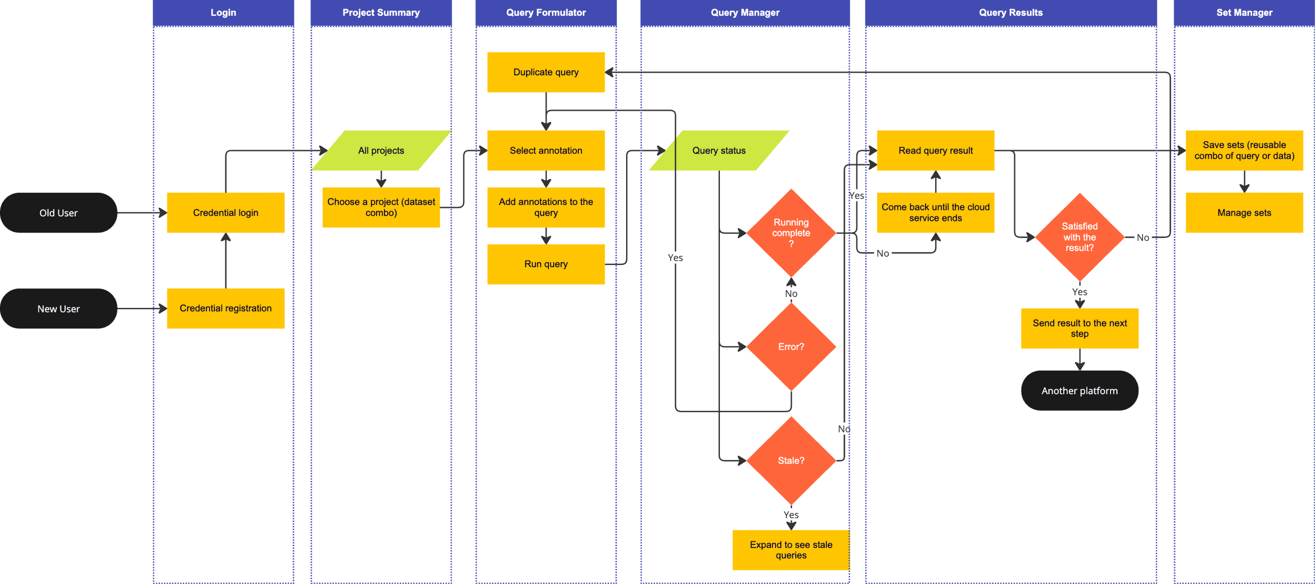
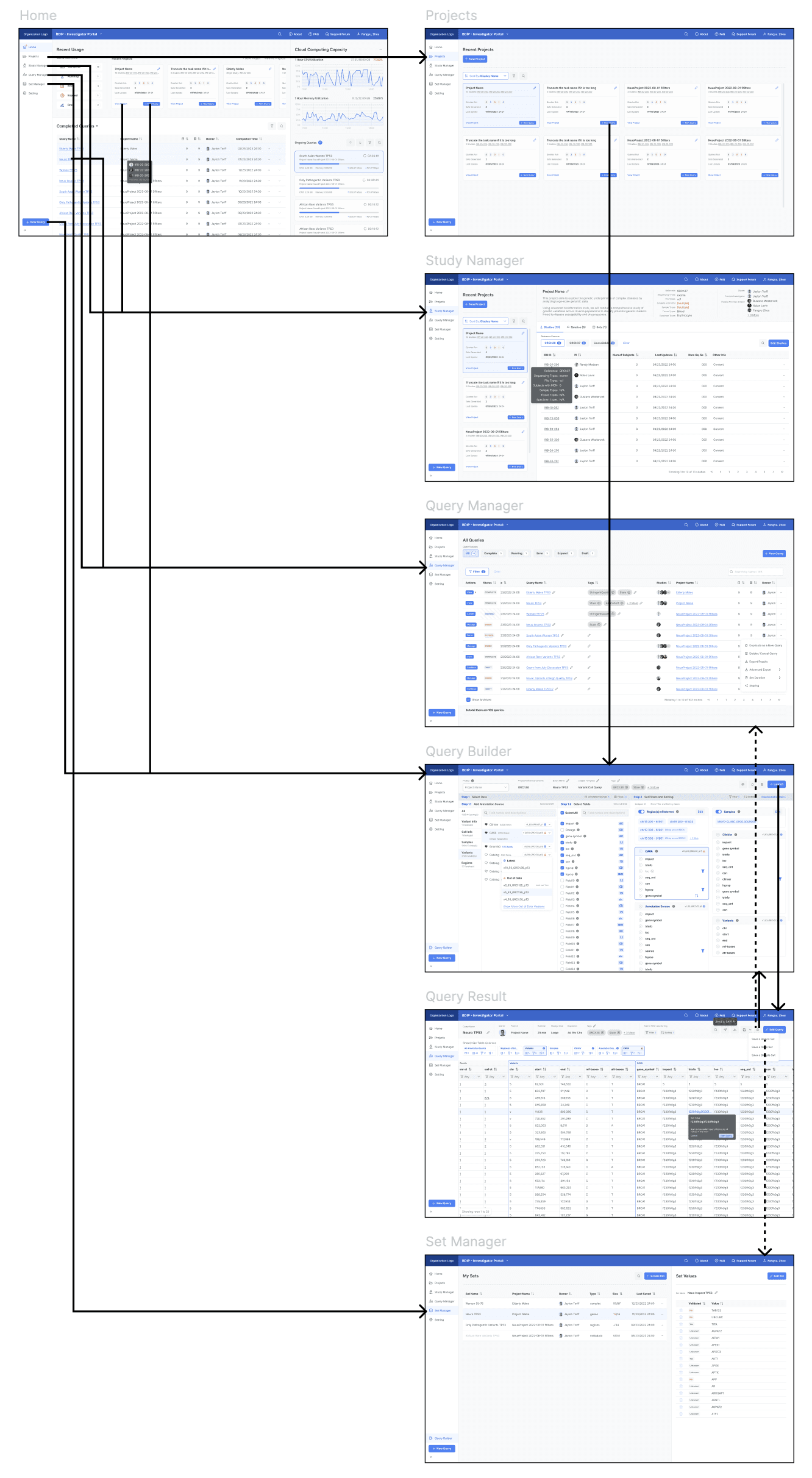
This is a 0-1 project that has no competitors, but the tasks users will perform by using this product are crystal clear. So I began by establishing the fundamental logic of the product and turn the tasks into a reasonable UI flow:
Choose the target user group for this phase
Build the framework of the product, identify the key flow, and propose a timeline
Collaborations
The genomics domain is highly complex and challenging to understand. To understand the design issue, I collaborated with the product owner, who holds a PhD in the genomics domain. The product owner gathered preliminary information from the clients and then brainstormed with the design lead (for this phase) and me (as the assistant designer) to make the final decisions.
Three of us decided the target user group, the timeline, and a feature structure.
I translated this structure into an information architecture.
The design lead further refined the IA to ensure extensibility, and proposed the UIs for MVP.
Step 1: Choose target group user for MVP
We chose data scientists as the target user group for the MVP because they need more complex query parameters and have significantly broader use cases. These advanced use cases naturally encompass those of non-data-scientists, whose needs rely on the combination of algorithms developed for data scientists. Focusing on data scientists ensures robust algorithm and UI development that supports both groups.
Step 2: Clear the flowchart
Step 3: Design the information architecture
Step 4: Propose timeline
The Query Formulation and the Query Result are the key steps of the flow, since the user takes the most actions in these 2 steps. We decided to spend the rest of time to iterate these 2 features after establishing the workflow.
Step 5: Deliver UIs
I was the creator of several components and contributed ideas in the brainstorming (ideas above), the UIs were created by the design lead.
Usability Test 1
Challenge Statement
How do users perceive the design?
Division of Labor
The product owner designed a usability test with 2 key clients, they are also our typical users. I worked as a note taker and the deliverable organizer.
Findings
Handle the additional requirements - need to improve understandability and operation efficiency
Design the new features.
Eliminate UI inconsistencies.
Need to fix accessibility problems.
Phase 2
I was the lead designer in this phase
Design 2.1
Challenge Statement
Our clients suggested to add a lot more choices and filters in the query formulator. There’s no UI patterns in genomic software yet, while the workflow for building a query is very hard to understand.
How to make the flows and contexts understandable, shortening the time a user spends on it as possible?
Actions
I prototyped alternatives and compared pros and cons. I decided to use steppers to guide users taking actions while providing enough context information.
I also applied auto layouts and used design tokens to manage the new UIs.
UX Solutions
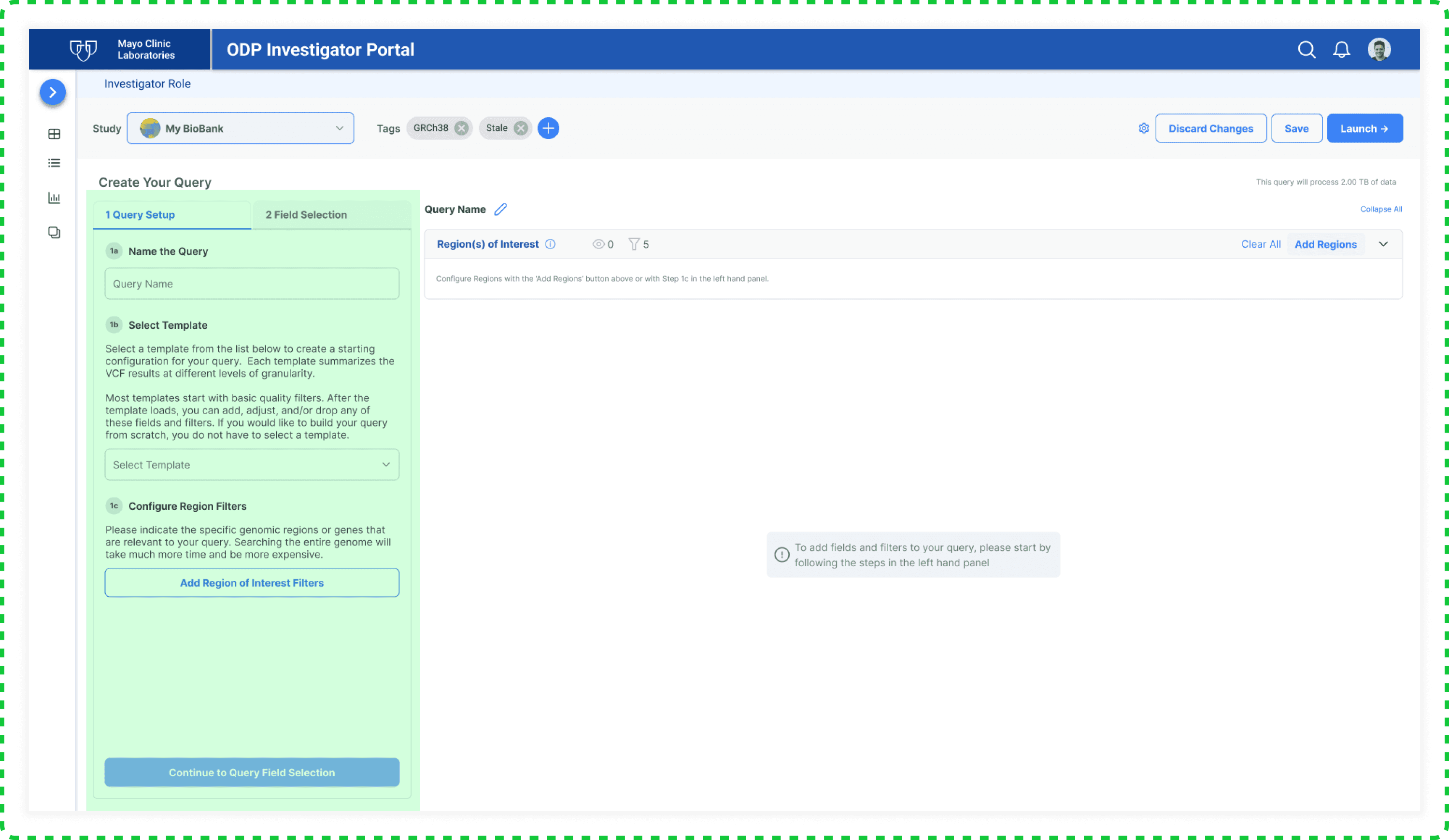
Stepper guidance for the <Query Formulator>
Before:
After: alternatives
The stepper instruction iteration in the <Query Builder>, the green one was selected
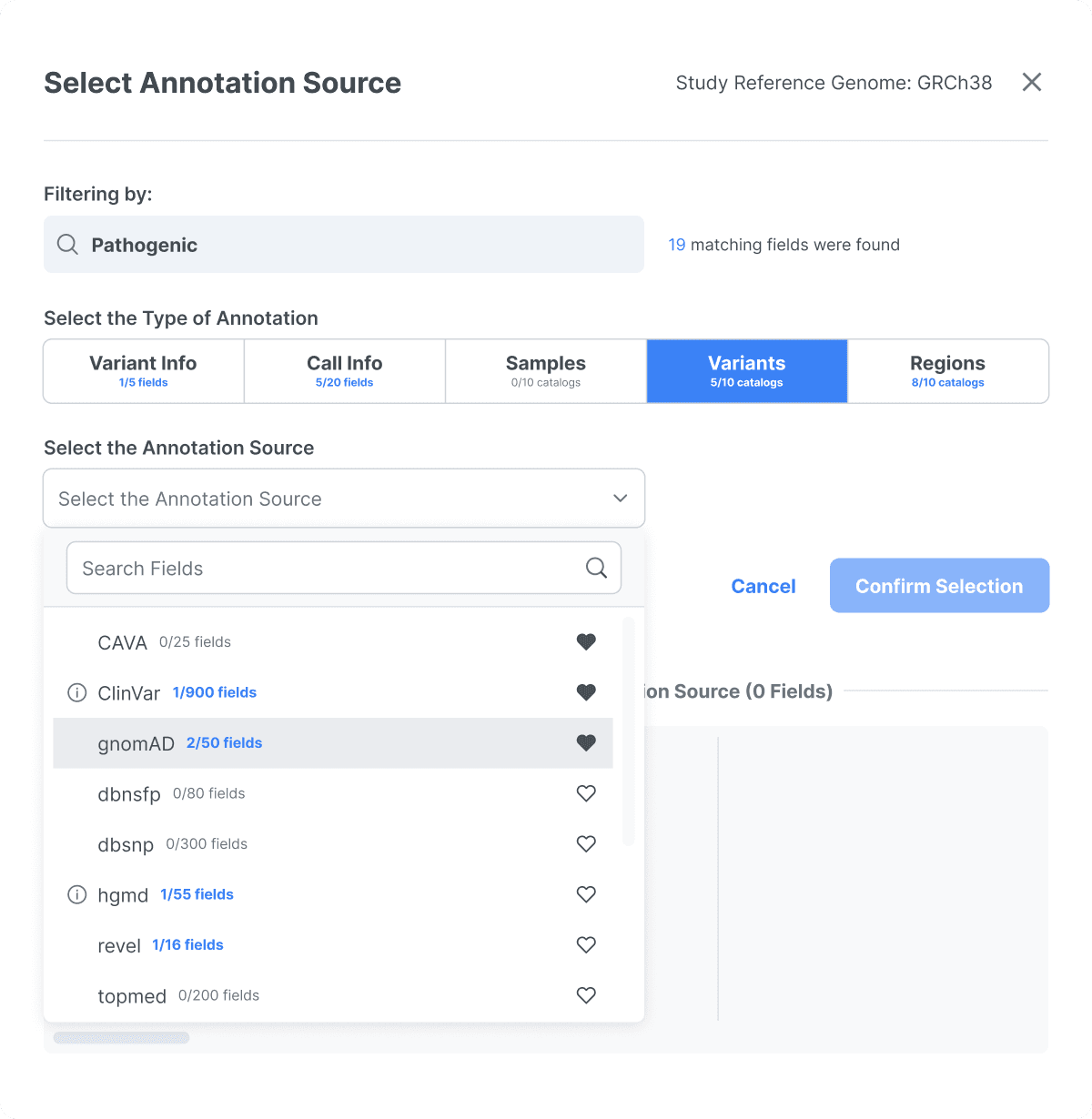
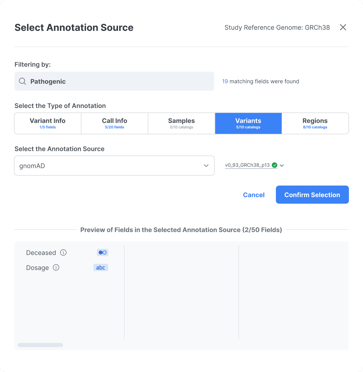
Super Search and Versioning in the <Query Formulator>
Before:
After:
To offer users 50+ options (it was <10 previously), I redesigned to place them in a popup window and introduced filters, terminology explanations, and a fav feature to help users make their selections.
Design 2.2
Challenge Statement
How to design the new features to support the filtering process?
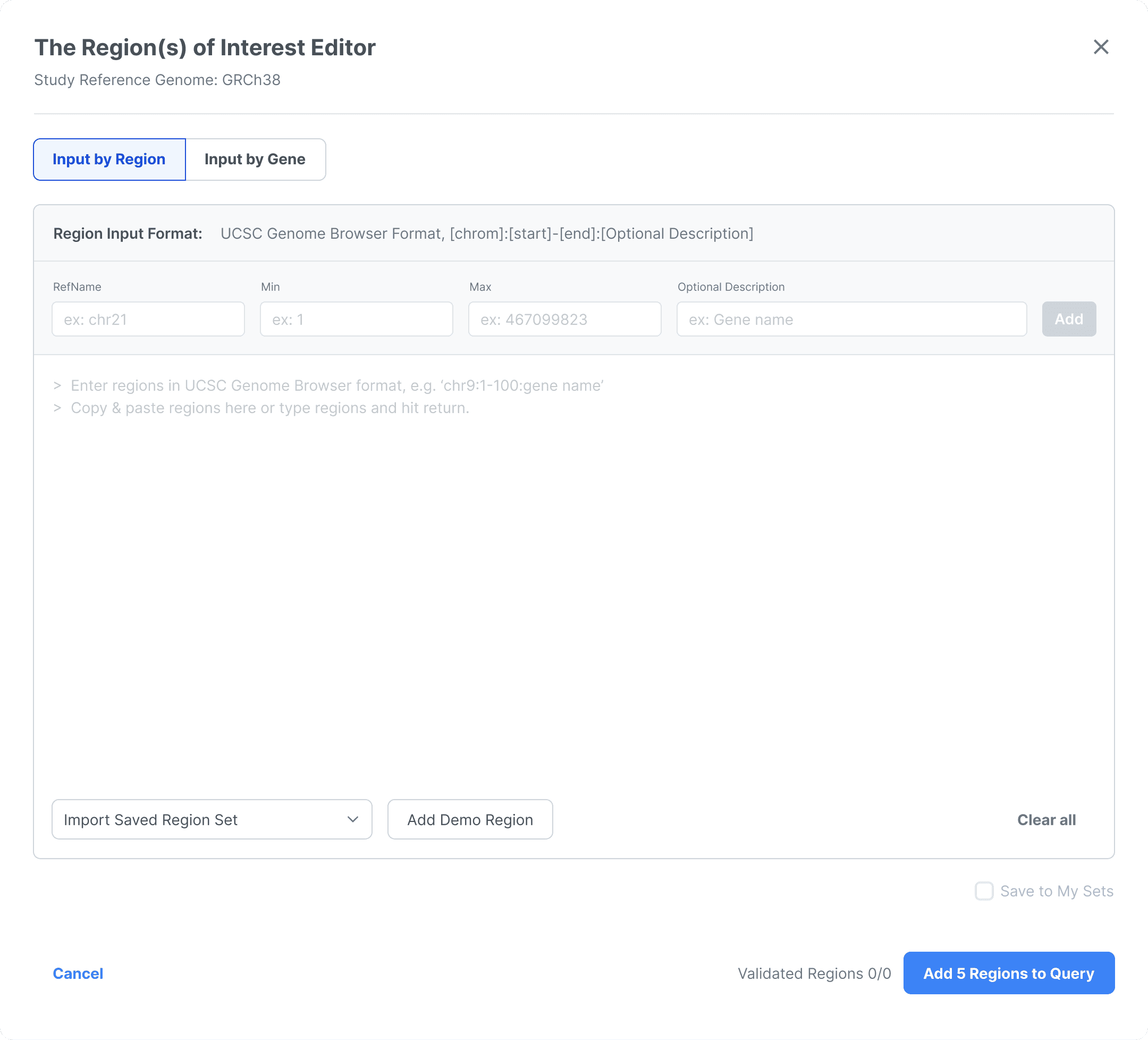
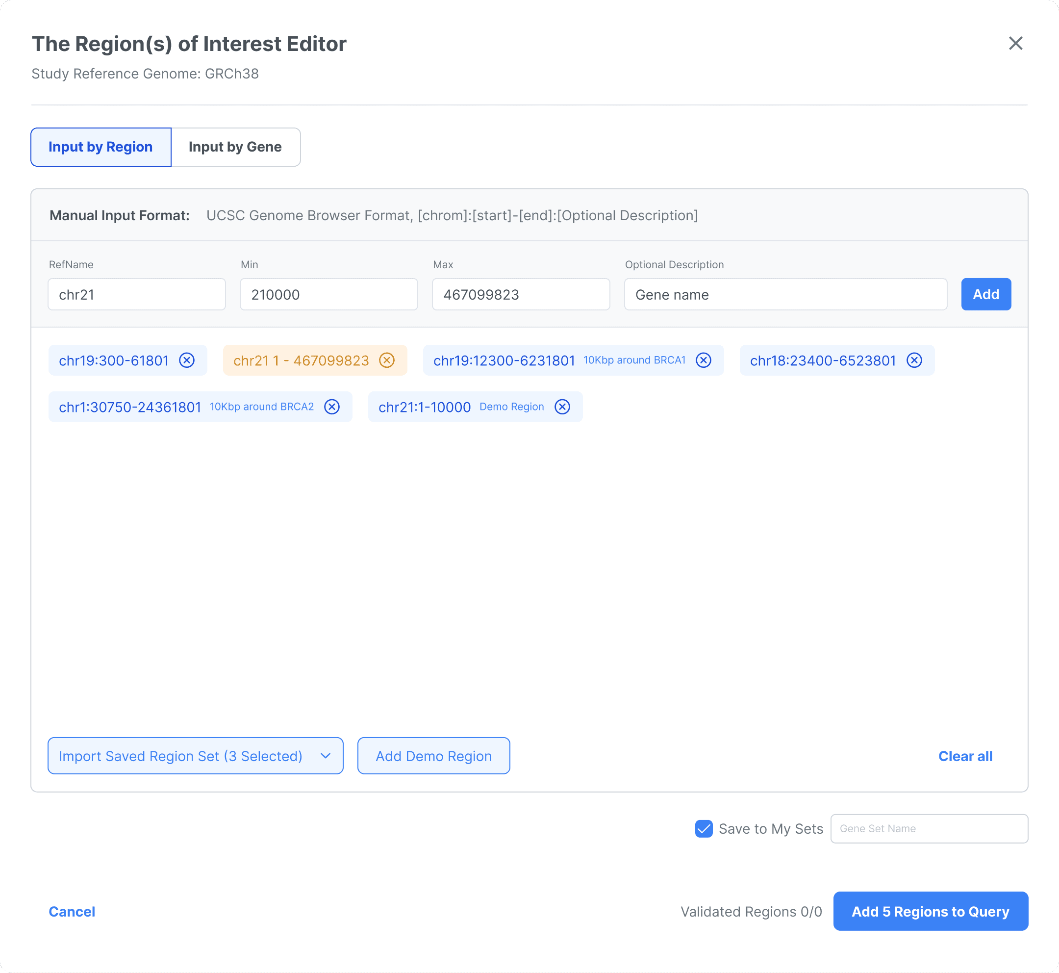
There are 6 different input methods, which can be used either in parallel or individually, for users to define the region of interest. Additionally, users have the option to save their selection.
Actions
I created prototypes based on the requirements, ensuring alignment with the new UI tokens, including font, color, spacing, and grouping method.
I conducted a simple usability test with 2 colleagues who were not on this project, asking them to think out loud while looking at the static the interface. They shared their guessing of the available actions and the system's responses to those actions.
UX Solutions
The <Region of Interest Editor> in the <Query Formulator>
An iteration for the "Import Saved Region Set": Before user testing, I didn't realize that users might want to review their selections before updating, as selections were immediately converted into gene chips, losing track of the original resource. After testing, I added a selected status for "Import Saved Region Set".
Design 2.3
Challenge Statement
Even for data scientist researchers, they may not recognize every terminology. Understanding the terms is crucial for users to query data effectively. I used the information icon is to provide the explanations.
How to provide the right amount of explanation in the right place?
How to keep consistency of the information triggers?
Actions
I conducted a consistency check by listing all instances where an information icon was used, analyzing the rationale behind each usage, and providing alignment suggestions for improvement.
UX Solutions
I decided to unify the text size on the same information hierarchy, and align the icon size with the adjacent text to keep the consistency.
I changed the outlined icons to filled icons. It helps users distinguish the text from the graphical trigger, making the list easier to scan.
I decided to use the information icon in two ways: as a hoverable item for users to access detailed information, or as a visual cue to indicate where information sits.
The info icon for the Field under different context
When users need a quick scan through more than a careful consideration, I chose to use the hoverable info for fields. On the opposite case, I chose to display the info itself to help users focus on discerning the one field.
Design 2.4
Challenge Statement
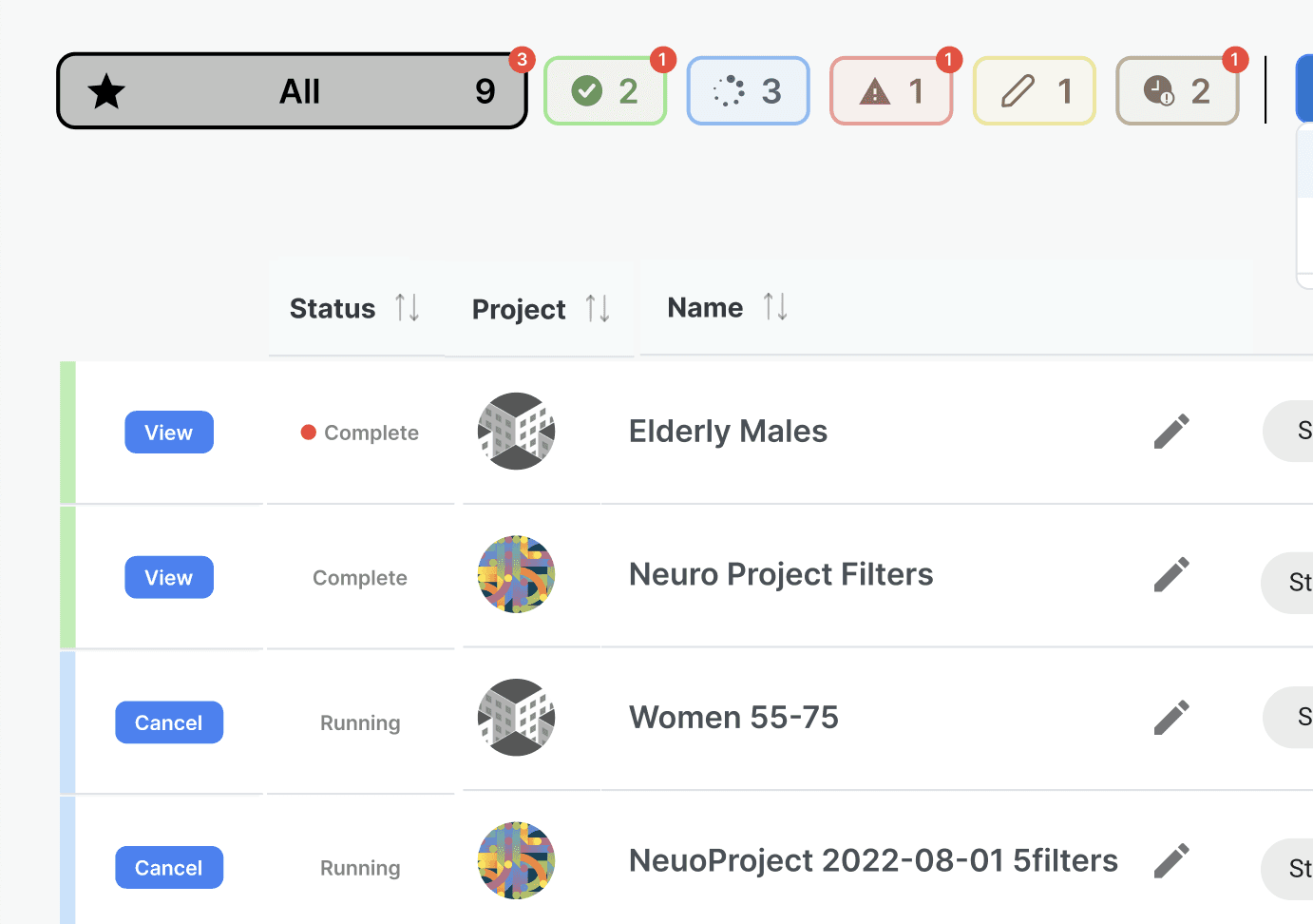
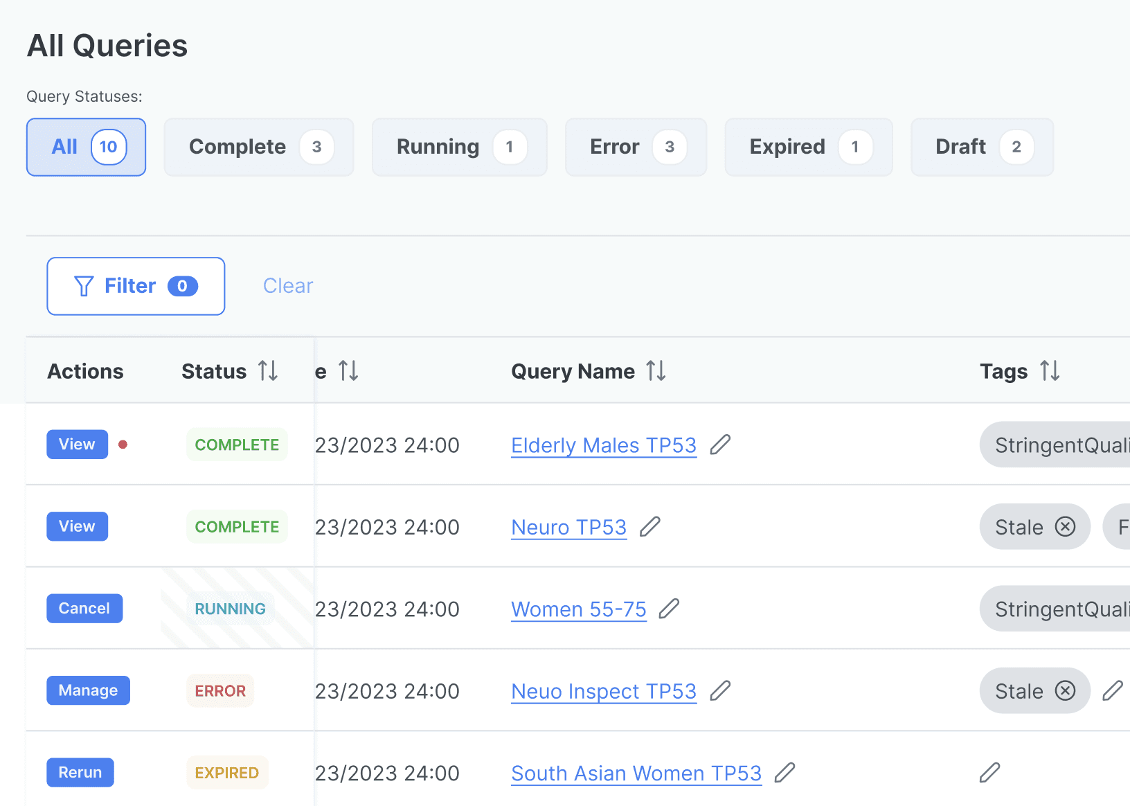
It very hard to notice the red dot (used to indicate new query updates) on the blue button. In addition, the colors of the navigation bar were inconsistent with the status background colors below.
How to improve the accessibility / usability of Query Management page?
Actions
Find accessibility / usability problems by a design walk through.
Prototype alternatives to find better solutions.
UX Solutions
Phase 1
Phase 2: adjusted color accessibility
I put the status color at the upper left corner, to help users notice this information first.
I put the same type of information in the same column for easier scanning through.
Usability Test 2
Challenge Statement
How do users perceive the design?
Actions
The product owner designed another usability test with 2 key clients, they are typical users. I worked as a note taker and the takeaway organizer. I wrote a usability report as a final deliverable.
Findings
Found new user behavior details.
Space utilization efficiency is under improved.
The team agreed that it's time to design for non-data-scientist researchers.
Further improve the UI consistency
Phase 3
I was the lead designer in this phase
Design 3.1
Challenge Statement
How to update the workflow to cover the new user behaviors?
Users usually create multiple test queries before launching a real query, as real queries often take a long time to complete. Most of the time, users check the query status to see if the real query completed.
Since the queries are run on the cloud, and the cloud service is limited, the users want to know if it's a good time to run the real query.
Step 1: Update the new workflow
Step 2: Update the information architecture
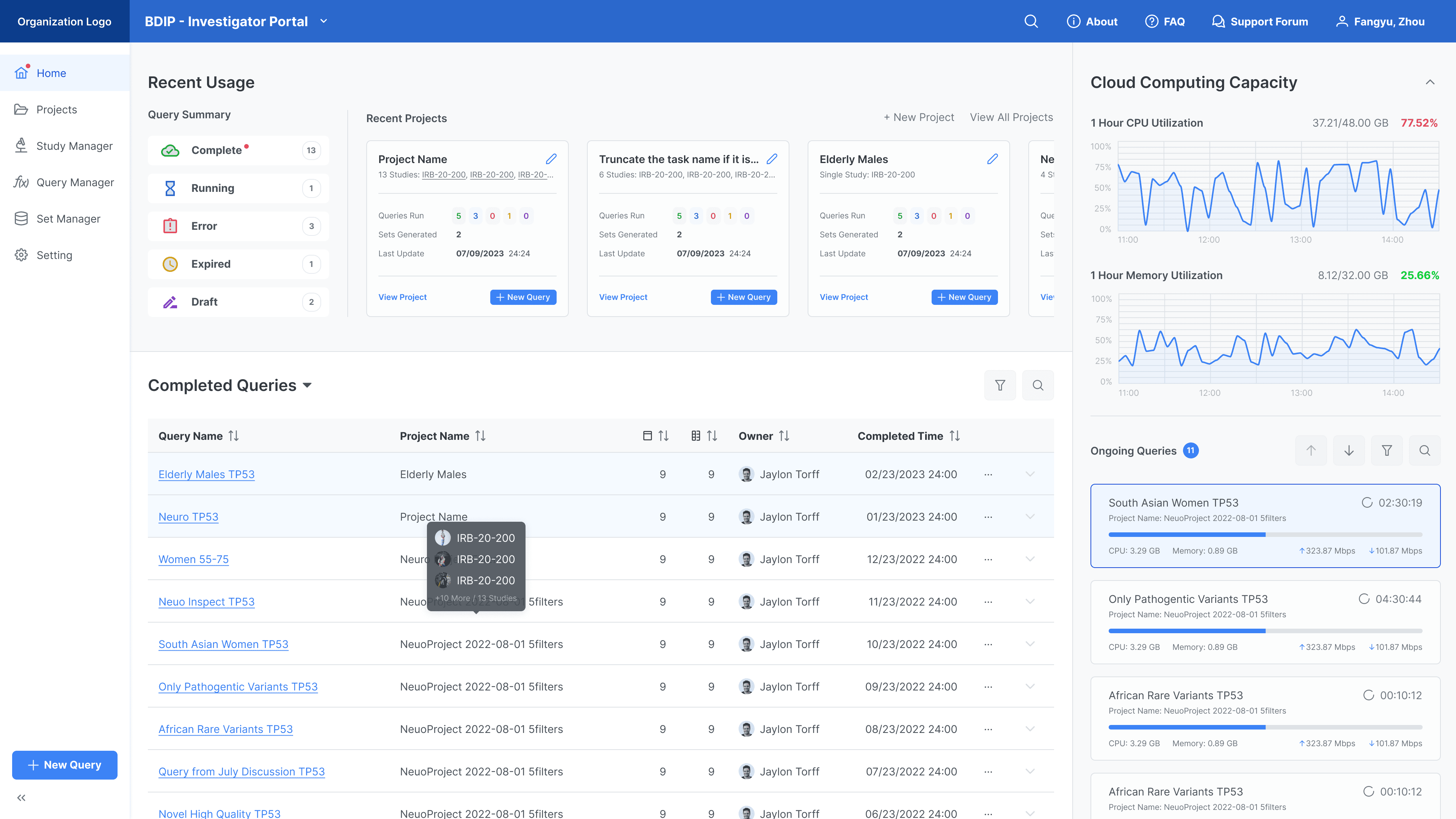
Step 3: Redesign the landing page
I decided to utilize the landing page to present the most recent query progresses and the cloud availability.
Usually, a user would focus on a few projects in a few months, so it's not necessary to present all projects this user owns on the landing page. Thus I used a large space to show the latest query progresses, which is the top thing a user concerns.
Design 3.2
Challenge Statement
How to improve the space efficiency?
(Query Formulator page) The right side show less usage rate and needs improvement.
(For the whole workflow) Users define the filter much more often than defining the sorting in the Query Formulator.
(Query Result page) Users wish to read even more data in this page.
Actions
I made iterative prototypes to meet feature requirements.
I also worked to reduce visual noises and align the UI with the design system.
UX Solution
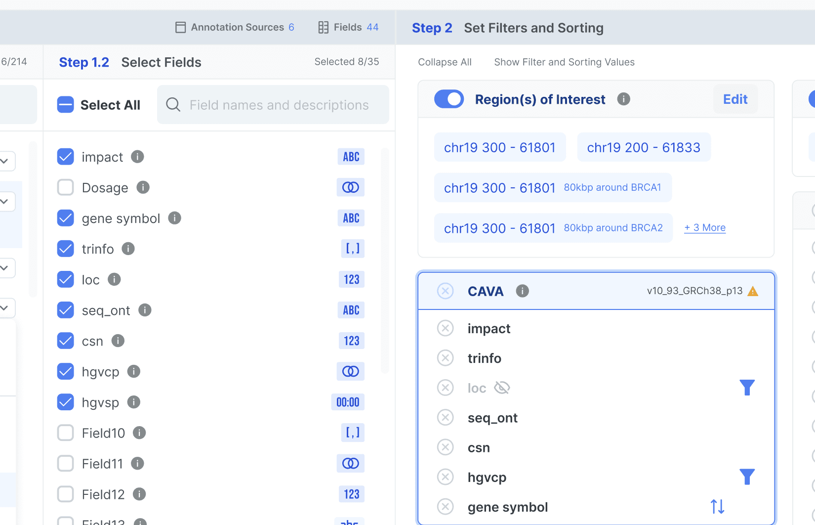
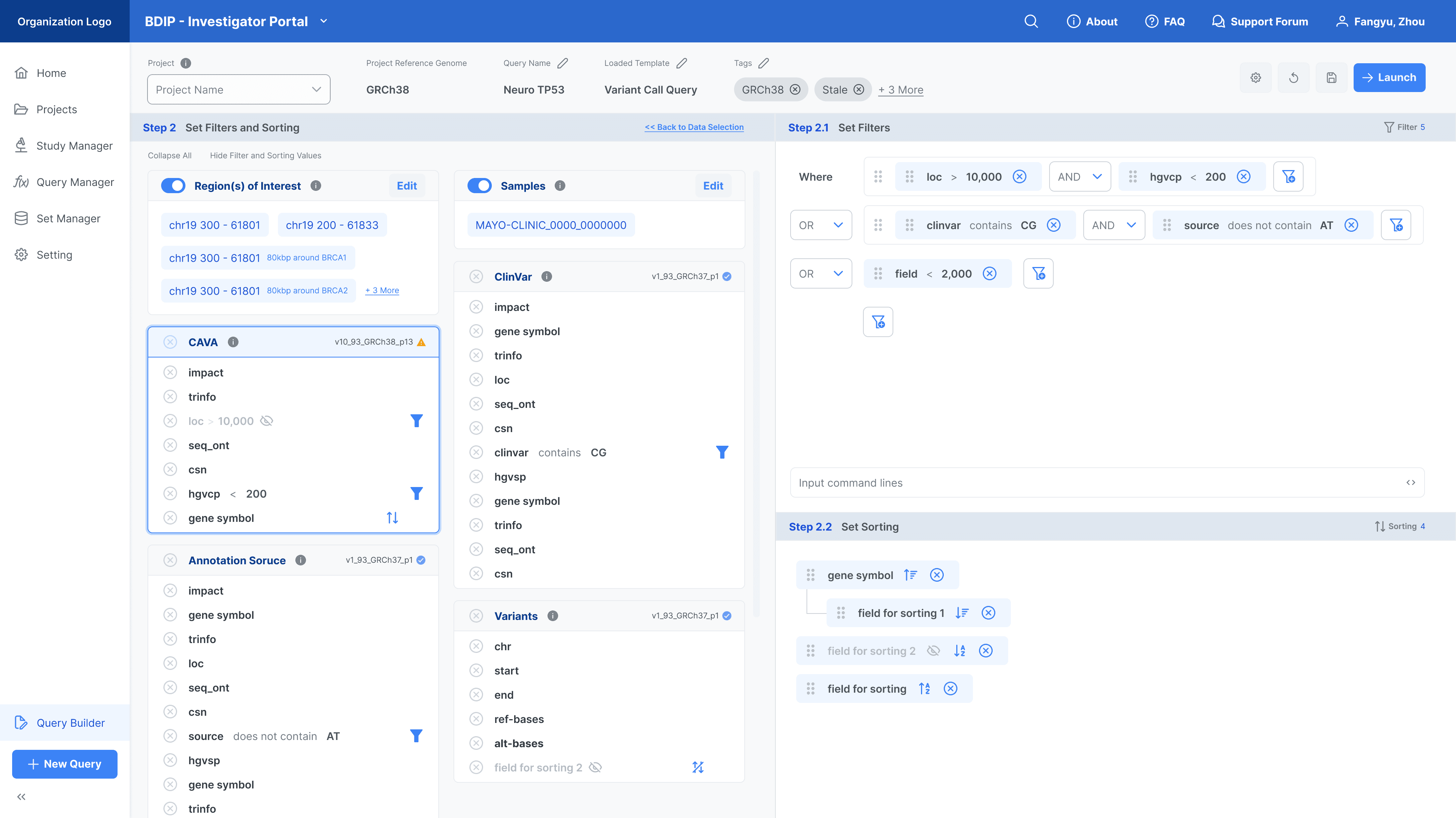
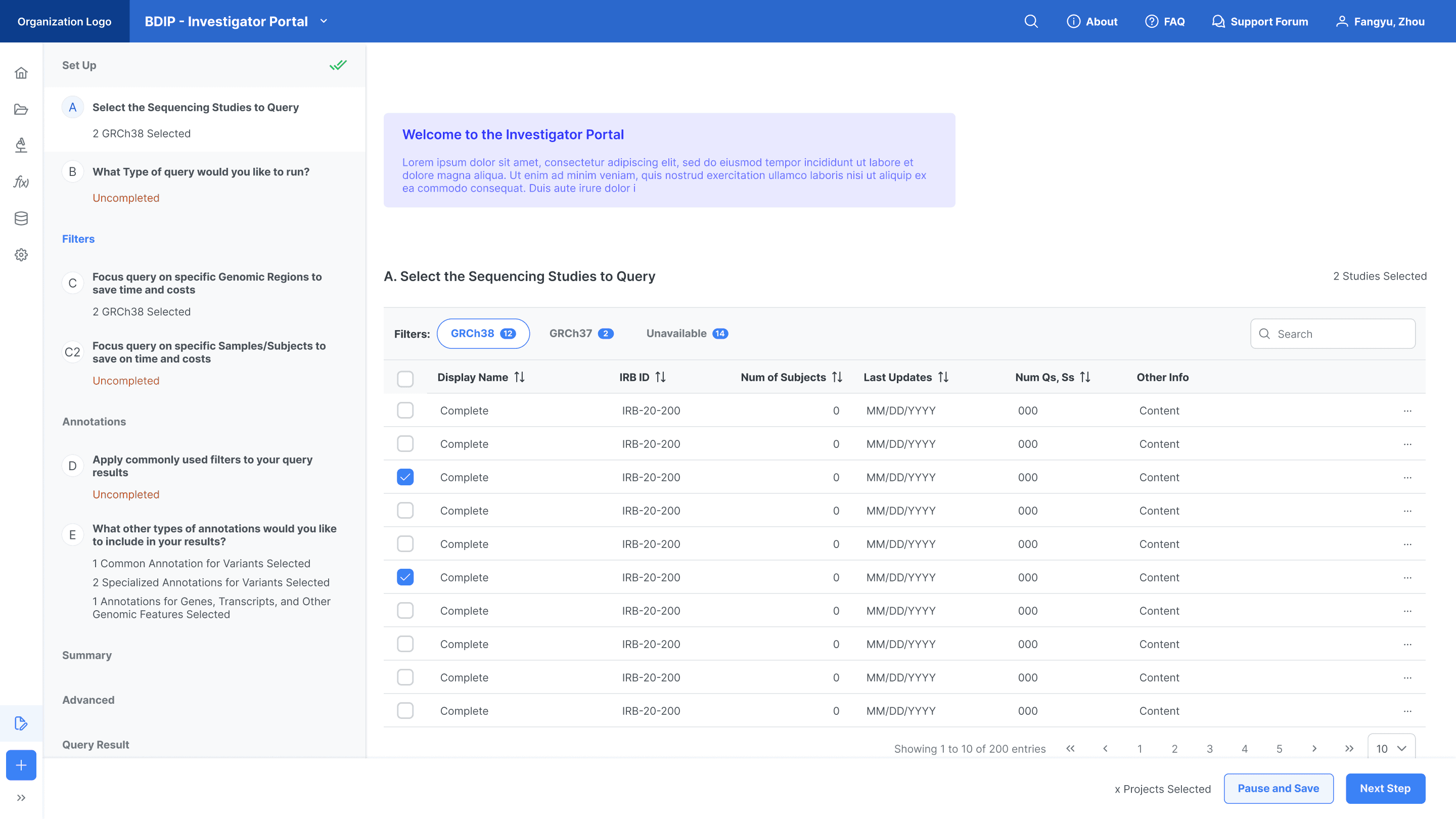
The Query Formulator page
Before:
After:
Flat visual hierarchy isn’t always the best. When a user need to work with massive information, placing appropriate information on the same hierarchy can ease their working memory load. In this case, a complex visual hierarchy can actually improve the work efficiency.
Since users need to switch between categories very often to add new annotation source from the step 1, I decided to put it (step 1) aside the selection result (in step 2) on the same page. Higher information efficiency is more important than helping users focus on the current action in this case.
To reduce the visual noise, I assigned background colors to steppers, making sure users notice and understand the workspace and how the features were set up.
I buried the sorting feature in a deeper place, while utilizing the landing page of the Query Formulator for selecting annotations and establishing filters.
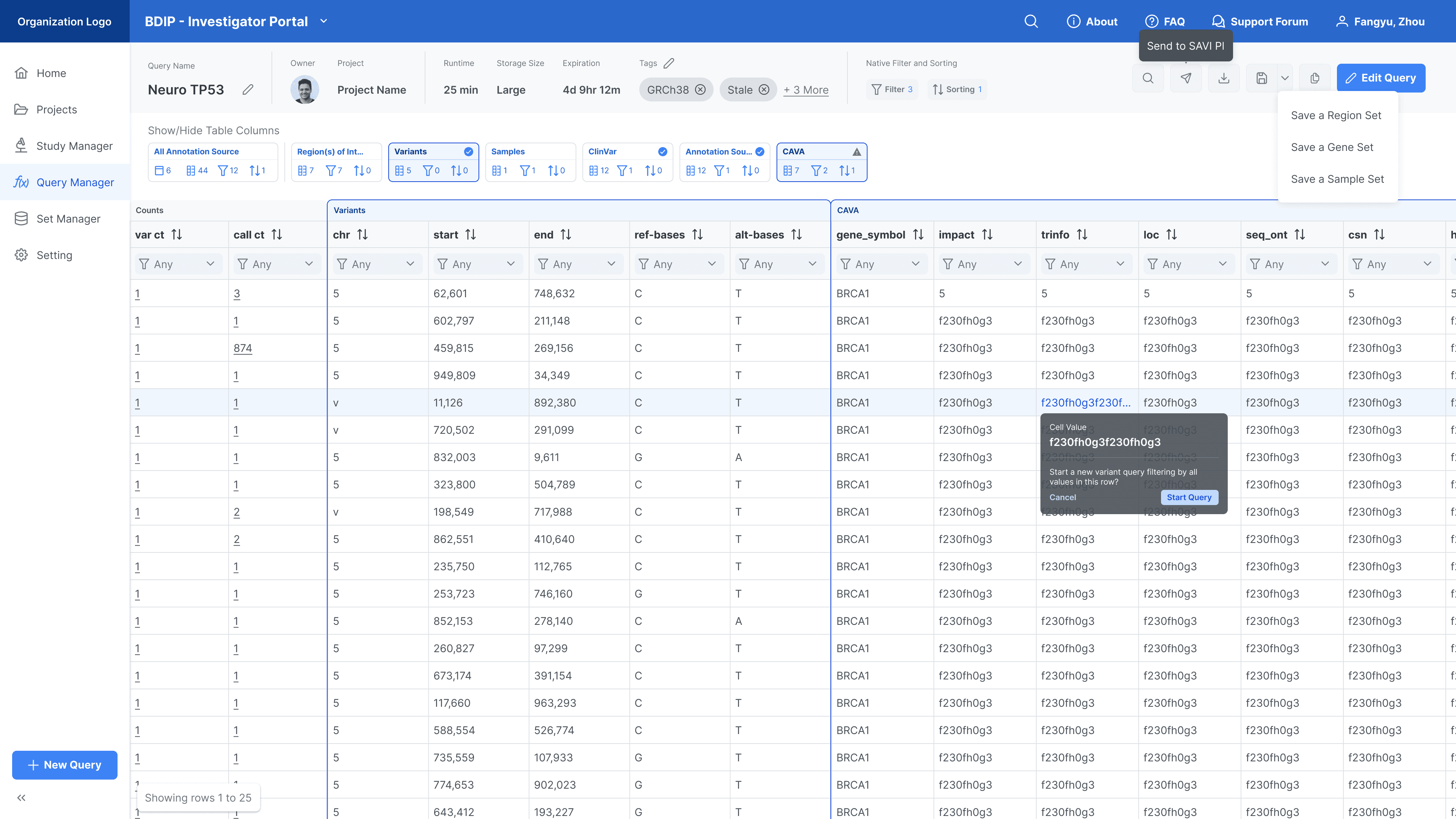
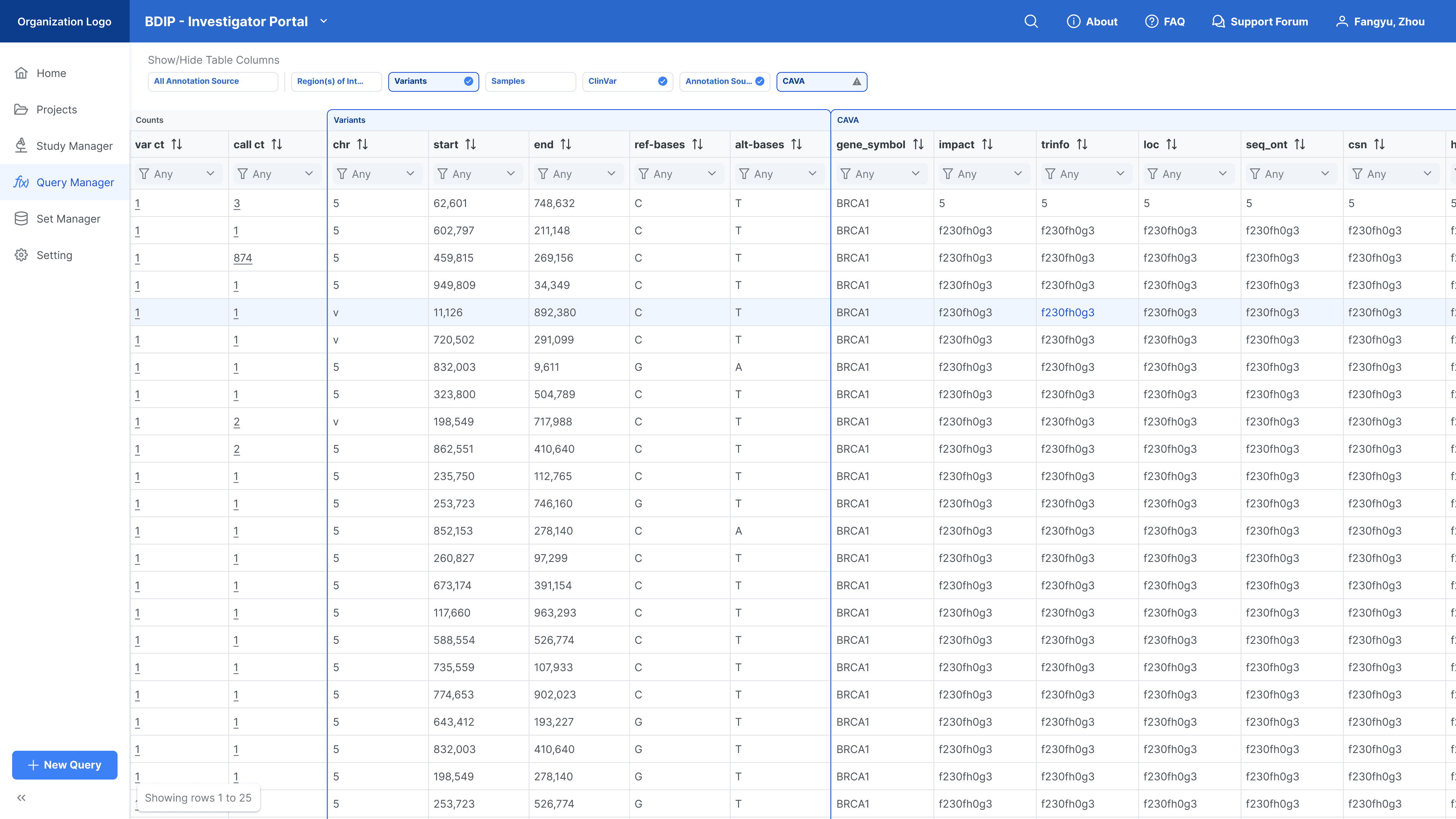
The Query Result page
Before:
After:
Query information is hidden when scrolling down. The paginator is simplified into a floating chip.
To inform the association between the navigation chips and the table sections (see column blocks, each block corresponds to a navigation chip), I streamlined their look and feel.
Design 3.3
Challenge Statement
How to adopt the current product and design for non-data-scientist researchers?
Actions
Our product owner helped me wrap reasonable choices into combos and interpret the combination with clear, understandable language.
I adapted the flow of non-data-scientists' process into a flow similar to that of data scientists, using steppers to guide their actions. Simplified components and interfaces were implemented to help non-data-scientists understand the complex, domain-specific choices.
UX Solution
I used a stepper navigation to guide users from taking actions.
I hide granular operations before users make a decision, helping them to focus on the key decision making.
Design 3.4
Challenge Statement
The client would like to apply the design system I created for this series of product in another project.
Actions
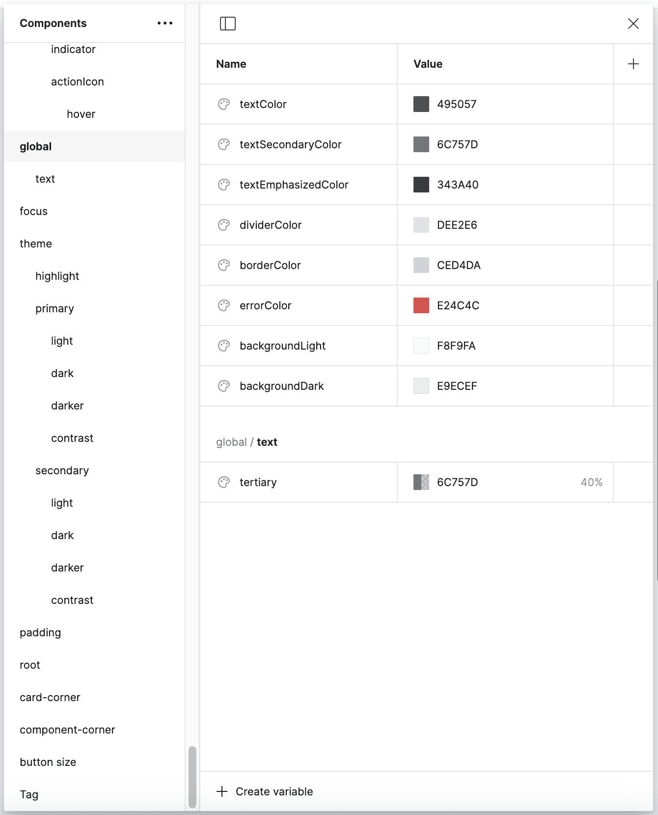
I created a Figma Variable color token sheet to apply the color palette, and applied the design system guidelines I had developed for another project. (The design system I applied was originally created for a series of 9 research products for the same client.)
UX Solution
The design system
<Query Management> page: further improvement based on the design system decisions
Phase 2: adjusted color accessibility
Phase 3: unified with the design system
I made further changes since I noticed that users primarily check updates on the landing page rather than on the query management page. Most users come to the query management page to find a query according to the creation data. To enhance focus, I reduced the colors in the navigation bar, making the status colors in the table more prominent and helping users scan through queries more effectively.
Phases Ended
My Reflections
Ways to understand a complex domain
Refer to my previous internships and learning experiences related to genomics.
Ask the right question to the right person.
Learn terminologies and technical problems from the product owner (who owns a PhD degree in bioinformatics).
Ask validative questions to clients.
Communication tools:
Drawing prototypes.
Describing scenarios, or giving other probes.
Using metaphors.
Learn the database and logic, and extensively use it. This is relatively a universal for most projects in my previous job.
References of design decisions
Observations and the synthesized knowledge gained from user sessions.
Dribbble (UI), Mobbin (workflow and service)
Design systems + logics specific to the project
Data management software
Design validation
Internal tests with any colleagues
Design critiques
Comparison with similar products
User test with real users
© Fangyu Zhou 2024 Selection · All Rights Reserved


