# UX Design
Data Visualization
Data Interactions
GIS (Map)
Web
Project 1: Little Beats
A BIT OF CONTEXT
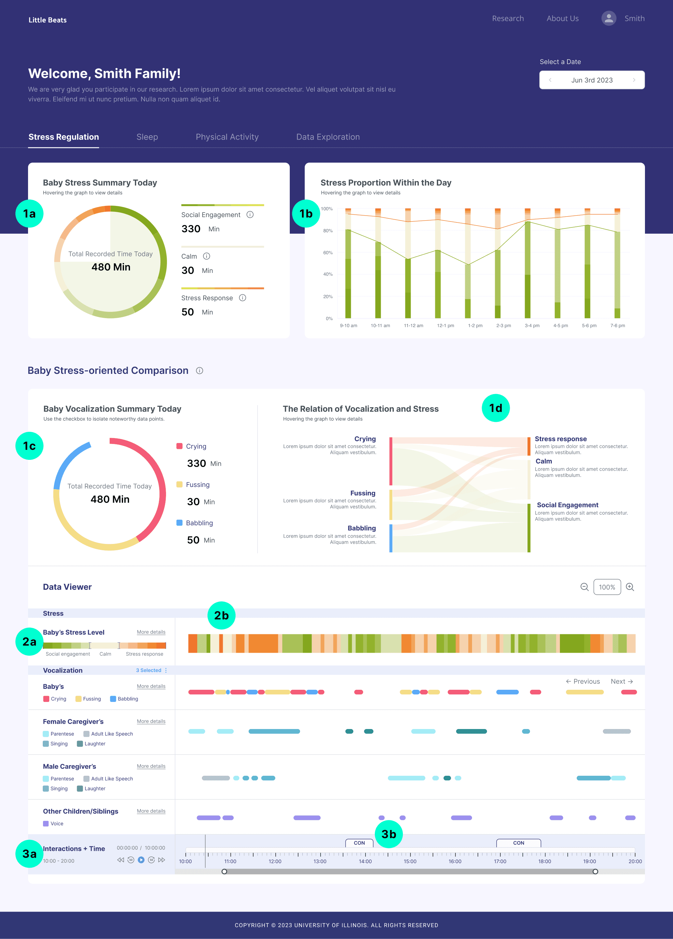
Little Beats is a project that studied stress regulation in infants. The study uses hardware to track infants’ Respiratory Sinus Arrhythmia (RSA) and vocalizations in participating families. I led the design of a web platform to present the collected data to these families, helping them understand the data privacy of the research, track the study progress and mechanics, and learn about research findings that can support them in managing their babies’ stress levels.
Data summary and controller
1a. Stress specific sum numbers
1b. Stress specific trend based on stress levels
1c. Vocalization specific sum numbers
1d. Cross data presentation between stress and vocalization
The linear data itself
2a. Data labels and legends
2b. Data points
Vocalization player
3a. Player label and player buttons
3b. Timeline for the vocal audio and vocalization labeling
MY REFLECTION
I explored interesting ways to play with the audio data: filtering data with data summaries (either the block in charts or legends), playing back the audio at an interested point, and zooming in and out.
I explored interesting ways to present data: ring chart, stacked chart, Sankey diagram, linear timeline charts, and combinations of charts.
I also had a chance to learn the design pattern of audio players.
Project 2: SPICE
A BIT OF CONTEXT
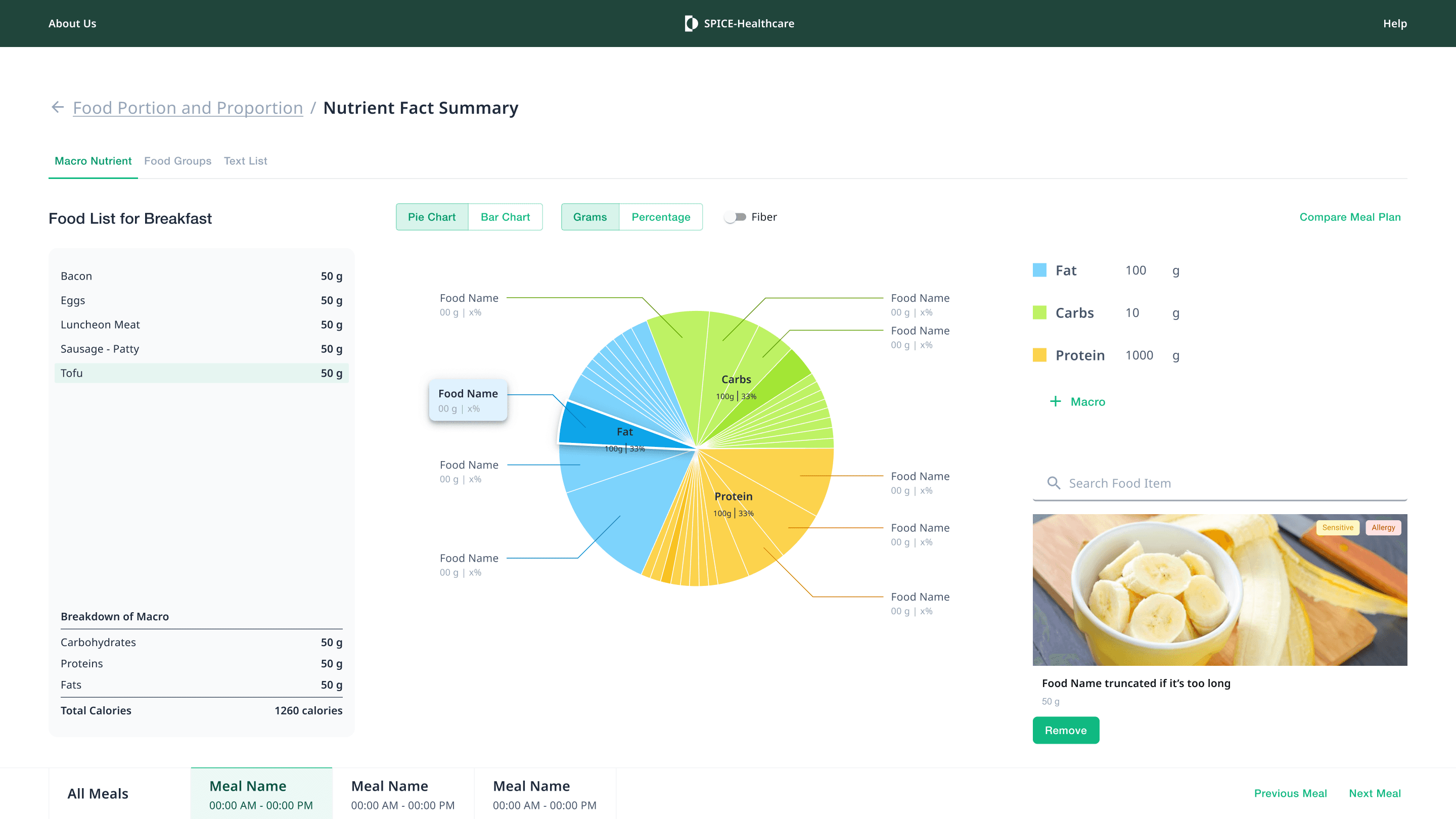
SPICE is a professional dietary assessment tool designed for dietitians and healthcare workers to better serve older adults in long-term care facilities. It aims to collect older adult's eating behavior data and provide them with suggested dietary plans. The data visualization below is an analysis tool that breaks down the food groups and nutrient information from an older adult's 24-hour meal recall.
The project was still ongoing when I left, so this is a sample of an initial data-vis idea presentation.
MY REFLECTION
I explored ways to treat overlaps and associations between data points. I chose to use hover actions to reveal underlying connections between data, while using regular click actions to allow for focused browsing.
Project 3: Direct4Ag
A BIT OF CONTEXT
Direct4Ag is a communication tool designed for Extension workers (researchers who educate farmers) to use in the field to showcase the latest research findings to farmers.
The presentation below compares drought-resistant corn seeds with regular corn seeds, illustrating the optimal soil types for the best performance, the yield of the experimental field, and the water retention capacity record of the drought-resistant seeds.
Research summaries
1a. Research site
1b. Research brief
1c. Data reading instruction
1d. User feedback survey
Two data stories
2a. Comparing performances between 2 seeds under the same field condition, the water-resistant seed wins.
2b. The water usage for the water-resistant seed over time.
Data reading tools
3a. Pointer to read 2 charts at one time point
3b. Legend as filter
3c. Vertical data story entry
MY REFLECTION
The biggest challenge in this project is understanding the research and defining the data story while ensuring a neutral and objective presentation. I learned to address this challenge by reaching out the right people for the key resources, diving deep into the reading material, using my common sense to make informed best guesses, and refining my ideas through iterative visual communications with the professional consultant.
Project 4: Challenger Expedition
A BIT OF CONTEXT
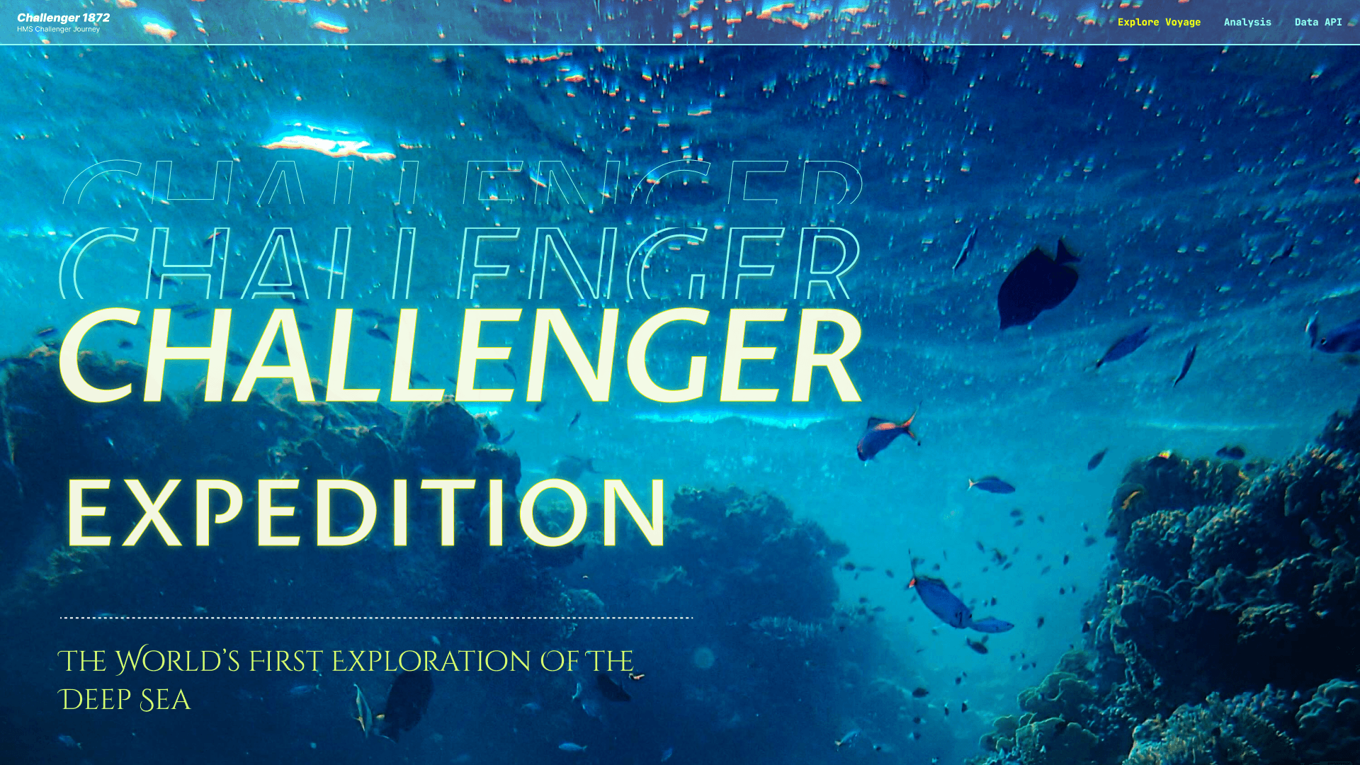
The Challenger Expedition is a presentation website that exhibits the historical oceanic data collected in the 19 century. The precious database preserves a baseline for the pre-industrial ocean. I designed to make it interactive and open to the general public.
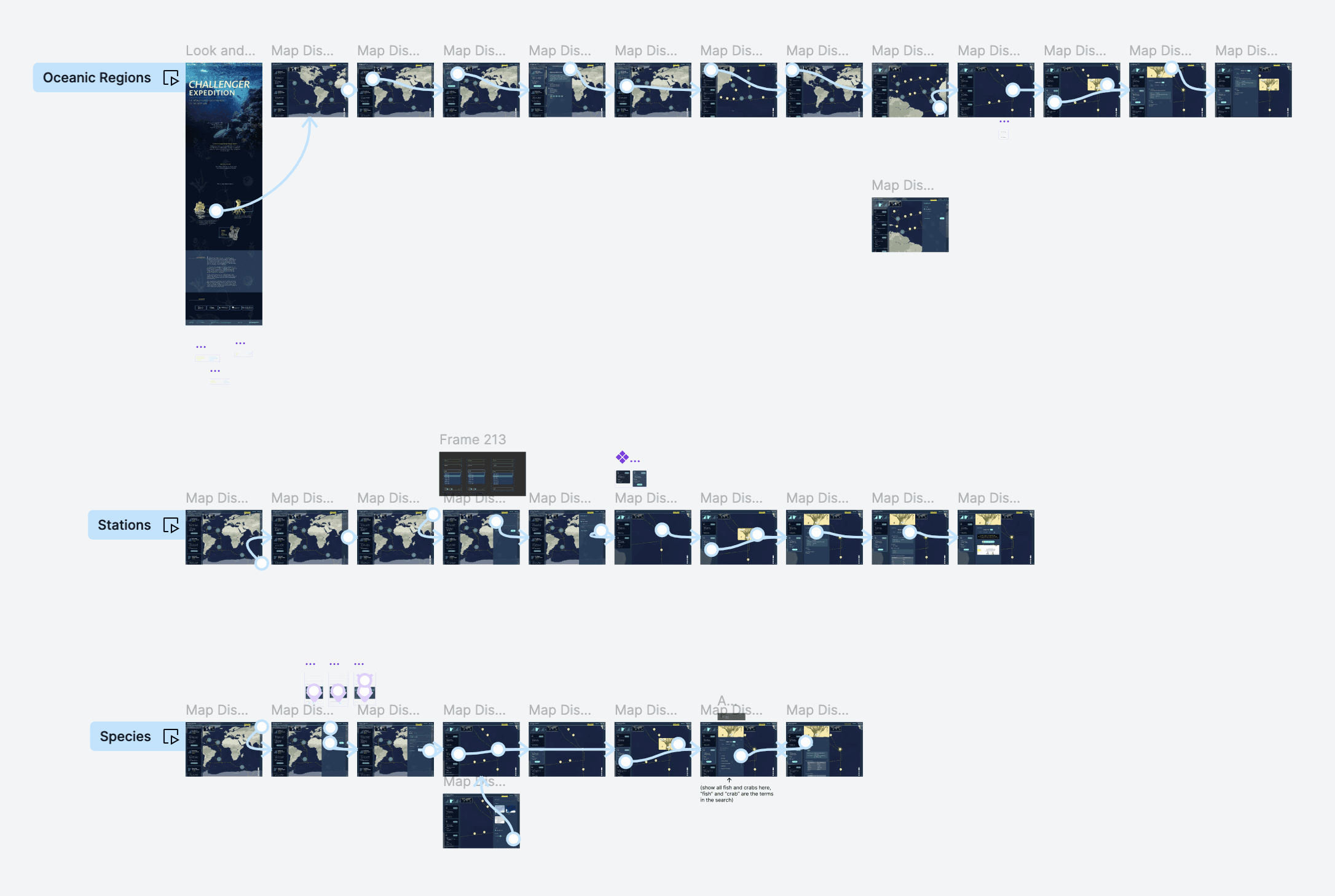
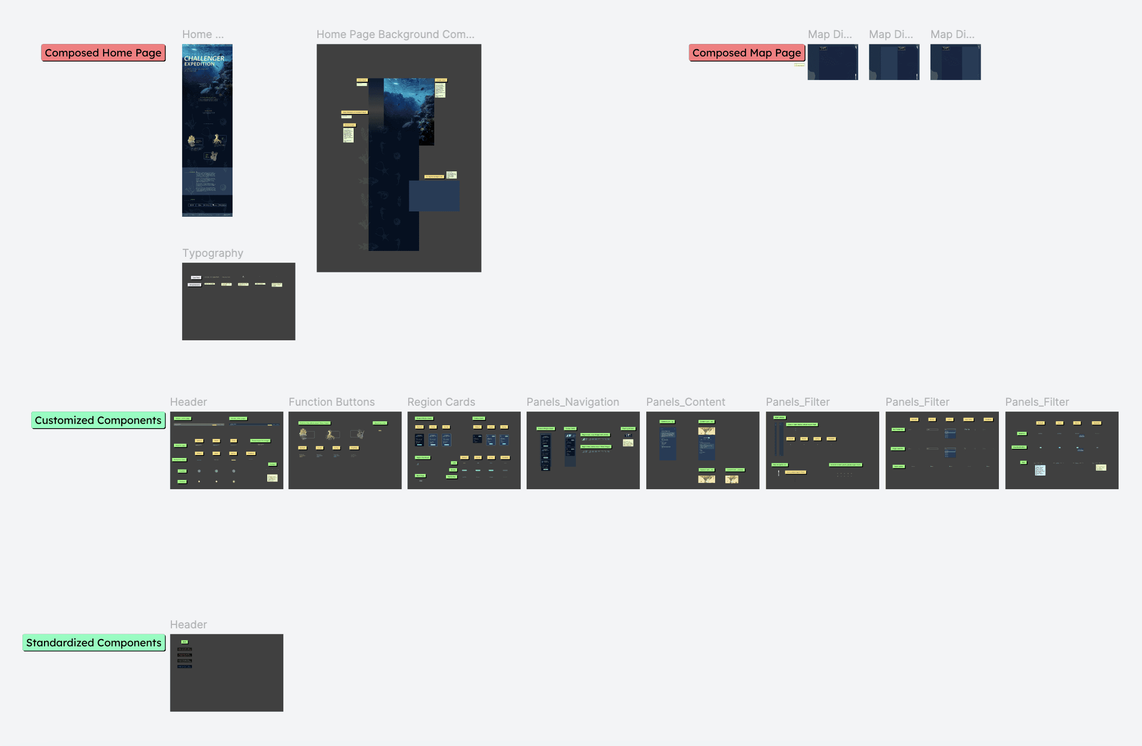
DESIGNS
THE CURRENT IMPLEMENTATION
HANDOFFS
MY REFLECTION
I practiced graphic design skills, e.g. mood board, color scheme, choosing font, micro interactions…
I explored the map design. Since the goal of the product is to include more people to play with the website, I reserved diverse navigation methods: navigating by dragging and browsing, navigating by informative cards (oceanic regions → sample site), and navigating by searching, meeting user's mental model ranging from general visitors to oceanic fans.
I also practiced to audit the UI with developers. I delivered static key screen designs, click thoughts, and handoff specs. I also closely collaborated with developers to adjust UI details by communicating what I read from Chrome inspect and the changes I decided.
© Fangyu Zhou 2024 Selection · All Rights Reserved

