# UX Design
Overview
CLIENT
Feeding Illinois
Market Maker
TOOL
Figma (Material You UI kit)
Android Studio etc.
MY ROLE
Lead UX designer
Lead UX researcher
Project Context
Situation
Google invested to help address the food insecurity issue. And concurrently, Feeding Illinois received new funding to enhance food quality for local hungry families. They would like to connect food banks with local farmers to collect surplus food directly from the fields, thereby reducing food waste and helping local small business.
Task
They need me to design an app that turns this idea into a concrete, usable app to connect with farmers.
User
The user group wasn't been specified until phase 3, but it has always been designed for buyers (food banks) and sellers (local farmers)
Buyer: Illinois food bank managers, and farmer buyers in the community (e.g. apple cider maker)
Seller: local farmers in Illinois
Phases 1 and 2 was hidden, they contributed some legacy designs to phase 3, wanna read it?
Decided the approach to achieve the ultimate goal, to reduce food waste
Chose the target buyer and seller for MVP
Built the framework of the product
Merged MarketMaker's branding with Harvest Hub
Read Phase 1 & 2
Phase 3
Mar. - Jun. 2024, 30% FTE
Phase 3
Mar. - Jun. 2024, 30% FTE
Phase 3: Re-understand the Problem
Challenge Statement
I felt the designs in previous phases didn’t meet my standards, so I used my spare time to redesign the project with the goal of submitting it for a design award, redesigning the whole concept and UIs of key screens. Now I have plenty of time to learn about the design issue to inform my design decisions.
So the design challenge is: How to redesign and uplift Harvest Hub?
Actions
(I collected user data from 12 user interviews in previous 2 phases)
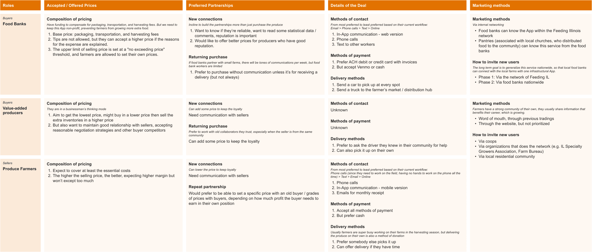
I analyzed and synthesized the data qualitatively. I created visual deliverables to communicate the results, including feasibility estimations and personas that present user motivations, goals, preferences, and current situations.
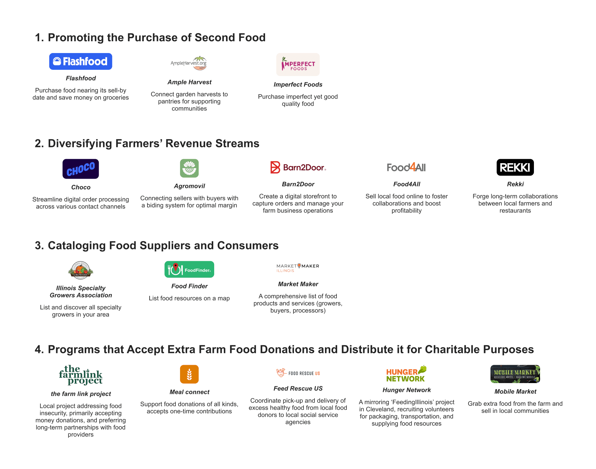
I also conducted a competitor analysis (similar product analysis in our case since we're a non-profit).
I had a design walkthrough and listed key points to redesign.
I updated the information architecture.
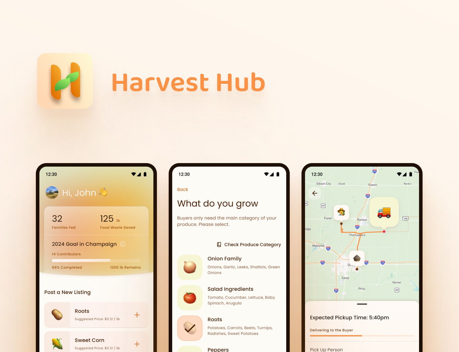
Ultimately, I delivered an enhanced app design for sellers, a new Android app design for farmer buyers, and a new web app design for non-profit buyers. This work is now being prepared for award submission.
Data synthesis + desk research = feasibility estimation
Work process
I found numbers from the user interview and open resources, and estimated the food demand, produce supply rate, and delivery capacity. The numbers reveal a balance between demand and supply.
Inference from the conclusion
Let’s assume the easiest way for a food bank to meet its needs: it purchases most of its produce from 1-2 large farms but still trades with 15 specialty farms each week to fulfill all demands.
🖥
The numbers support the decision to create an individual web interface for the food bank, they need a larger space to manage 15 tradings.
📱
It's still reasonable to create a mobile version for farmers, as they need to list surplus food frequently and promptly, especially during the harvest season, it happens daily and even hourly.
🙋♀️
This process involves driver and harvester volunteers, and the number of laborers significantly impacts the trading. We should consider them in future phases.
Qualitative data synthesis result: personas
It's a structured summary of insights gathered from user interviews.
Insight summary
Food category based communication
It's reasonable to base communications on an intermediate food category.
Operation efficiency
The app can help sellers set prices for their listings and enable price editing through in-app communication.
To mitigate frictions of negative feelings, simplify the information input operations for sellers.
To mitigate frictions of negative feelings, display delivery progresses.
Create a web app for non-profit buyers to browse products, view information to assist in purchase decisions, and manage delivery timeline and labor assignment.
Broader donation and motivation
All user groups would like to have cash donation options in the app.
To encourage more tradings, add incentives to the app to help sellers feel a sense of achievement.
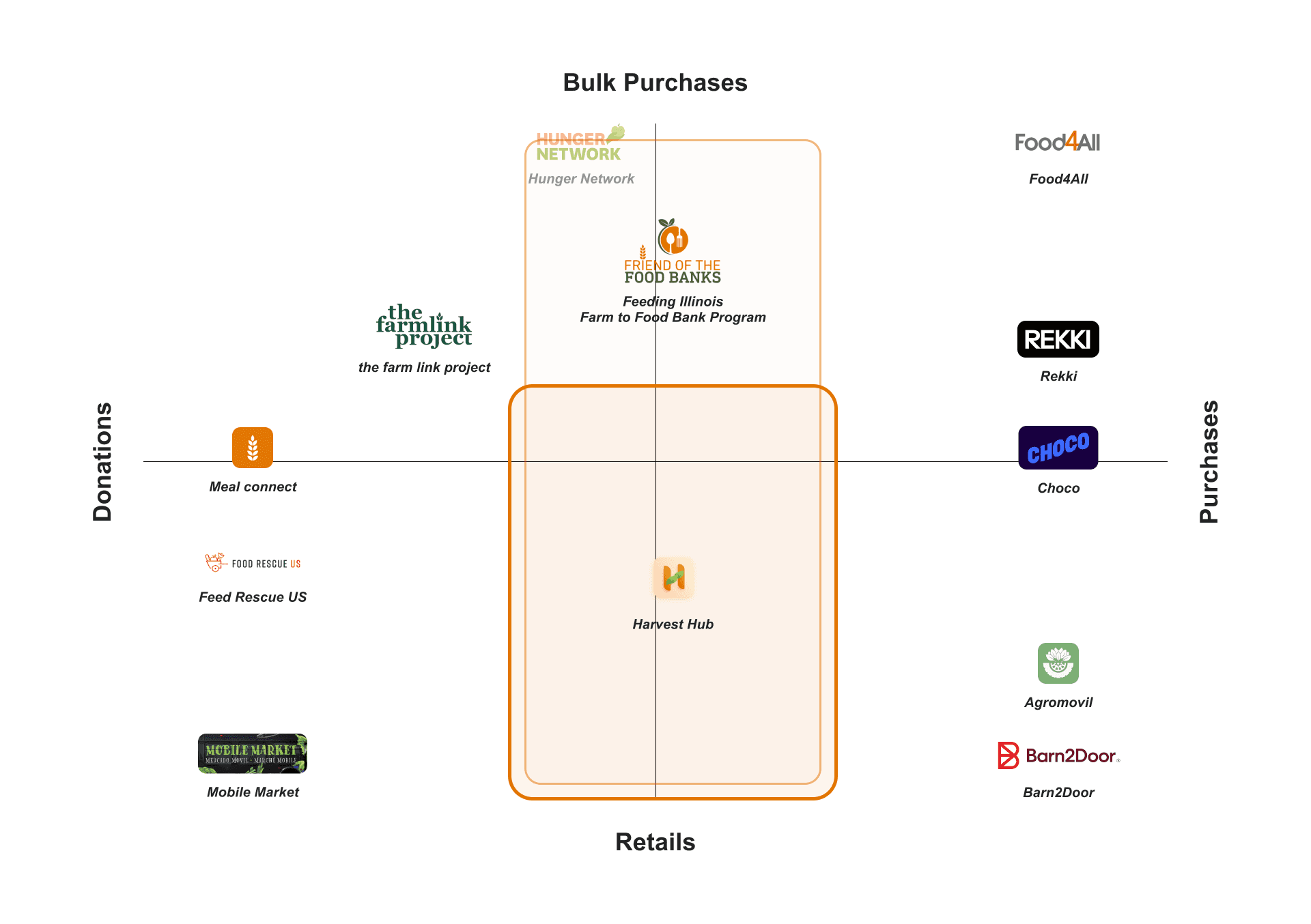
Competitor analysis (similar products)
This helped me understand Harvest Hub's positioning and mission. Currently, no product serves for low-volume donations and low-margin trades. As a charity work, it's reasonable for Harvest Hub to support this empty space by enabling monetary trades while extending the service to cover food donations, accelerating the reposition of surplus produce to make it more accessible to those in need, reducing waste and enhancing its charitable impact.
Deliverables: updated information architectures
Seller workflow information architecture
Farmer buyer's information architecture
Food bank manager's information architecture (merge in MarketMaker)
UX Design 3.1: Efficiency in Operation
Challenge Statement
Sellers are busy because selling surplus food is secondary to their primary work on the field, which is usually super occupied during the harvest season; and buyers are busy managing multiple purchases to meet local needs. To improve the possibility for the target users to get involved in such tradings, I need to improve the operation efficiency as much as possible.
Solution
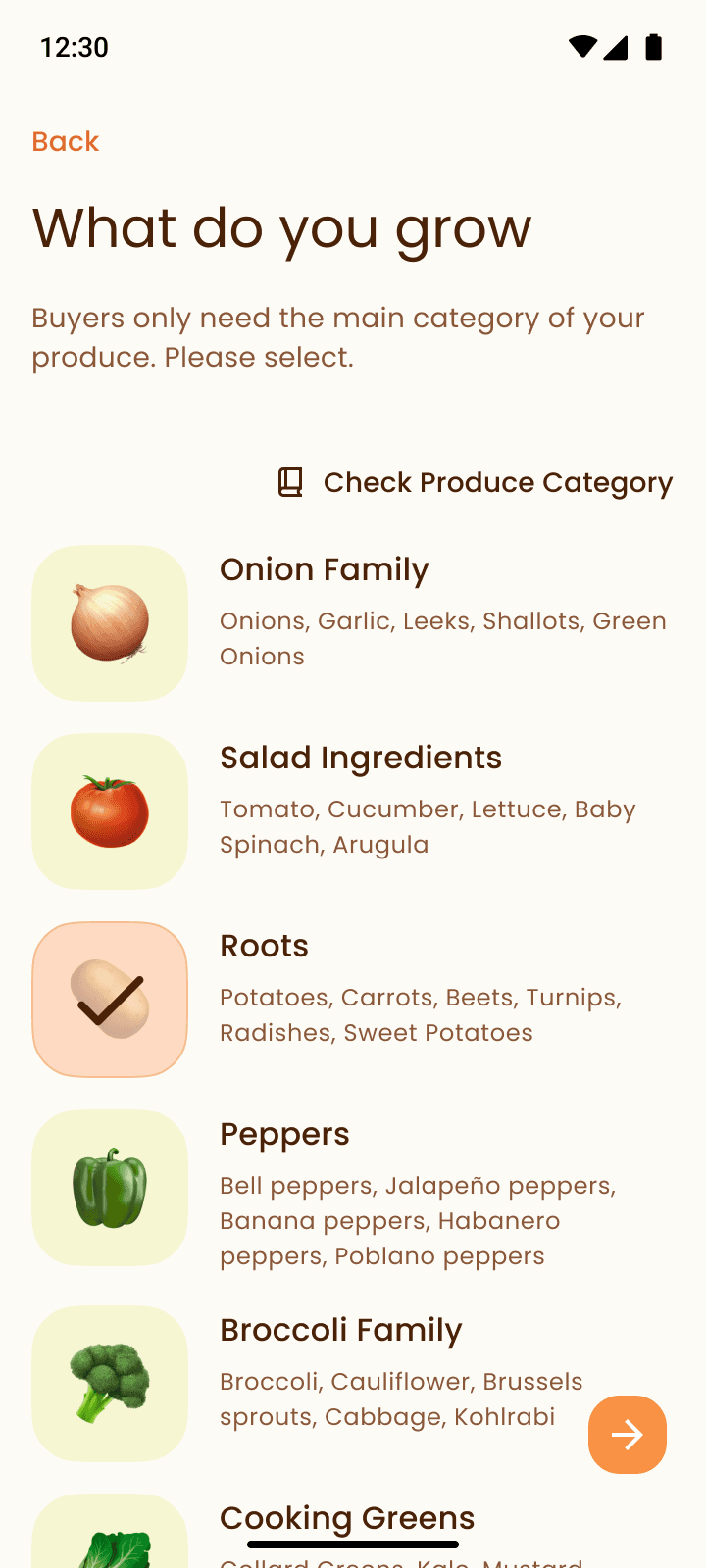
Seller's Usage of Crop Categories
Farmer Buyer's Usage of Crop Categories
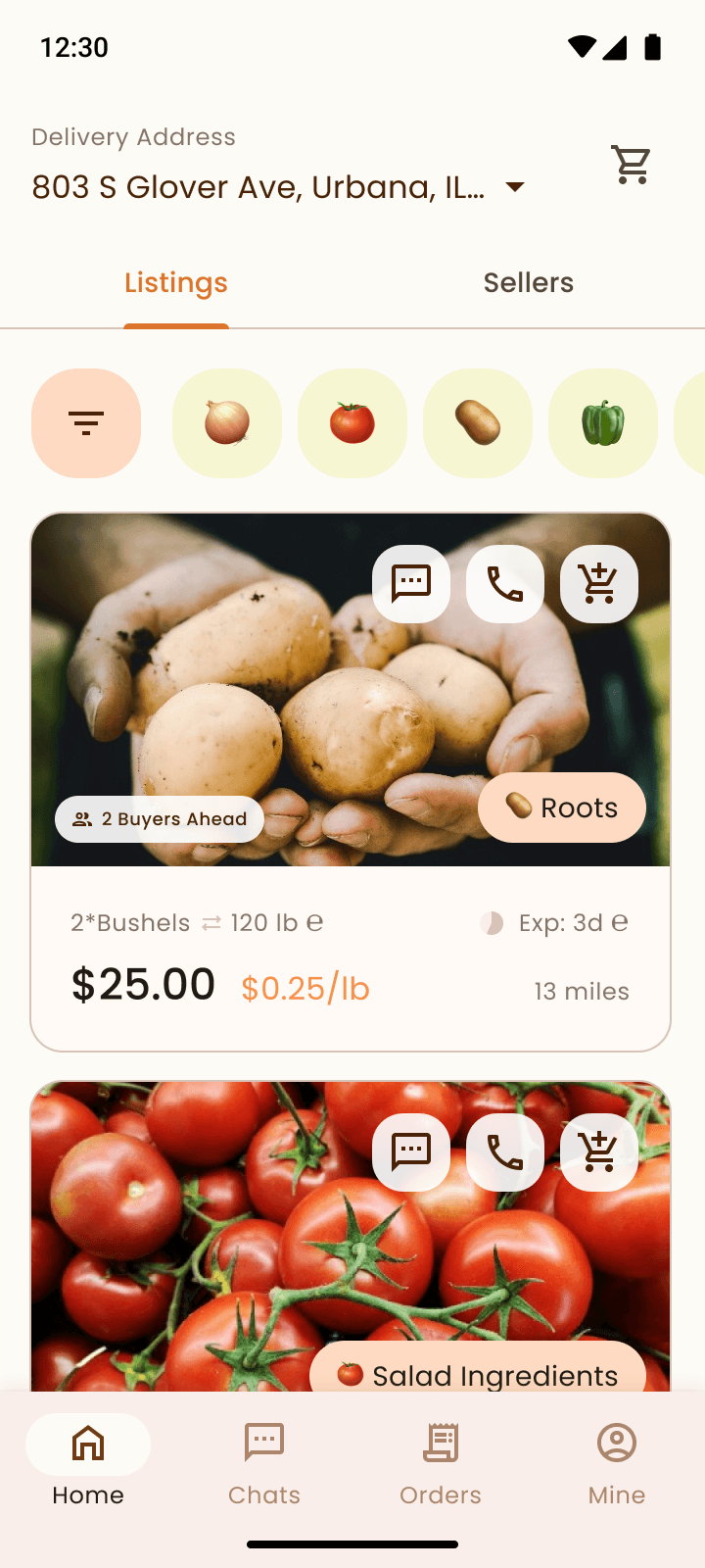
I redesigned to allow sellers to select broad produce categories for their items, and buyers to search with these broad categories too, to save time for both. Further communication is handled through browsing images, making phone calls, or sending text messages, rather than reading precise descriptions.
It works well since non-profit buyers are less concerned with specific species, and for secondary distribution, it’s acceptable to receive items slightly below expectations given the extremely low prices.
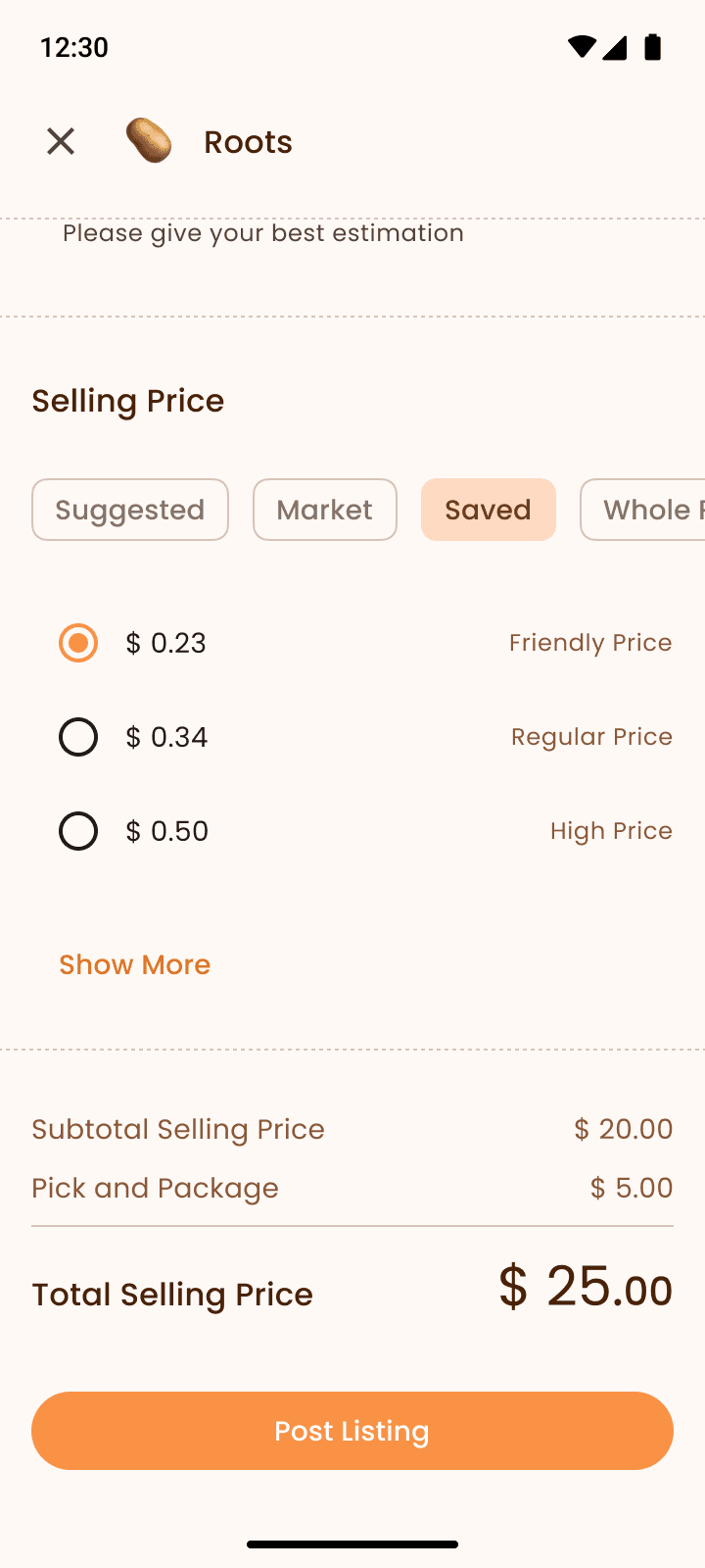
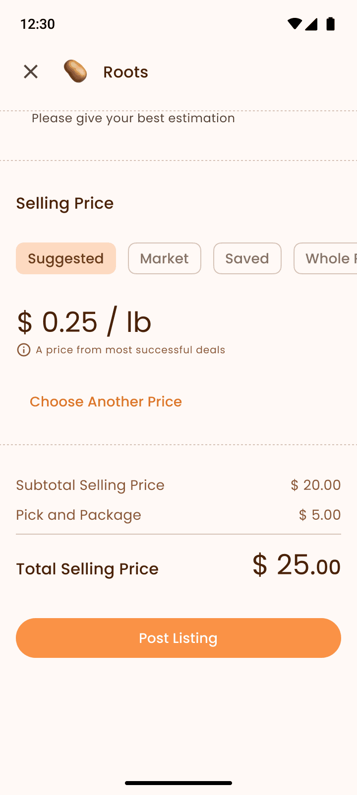
Seller's View: Post a Listing
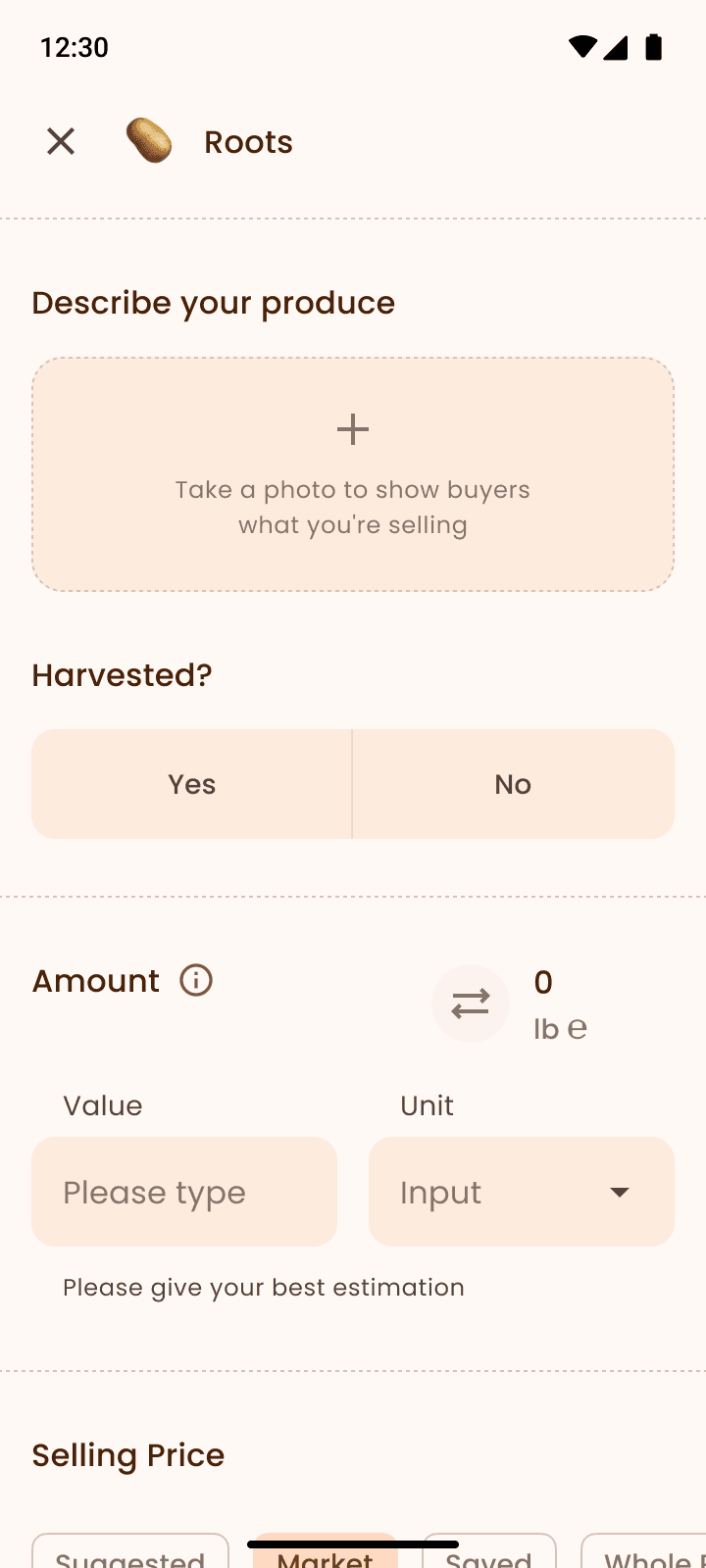
I re-designed to use images to communicate product details like quality, quantity, and specific crop species.
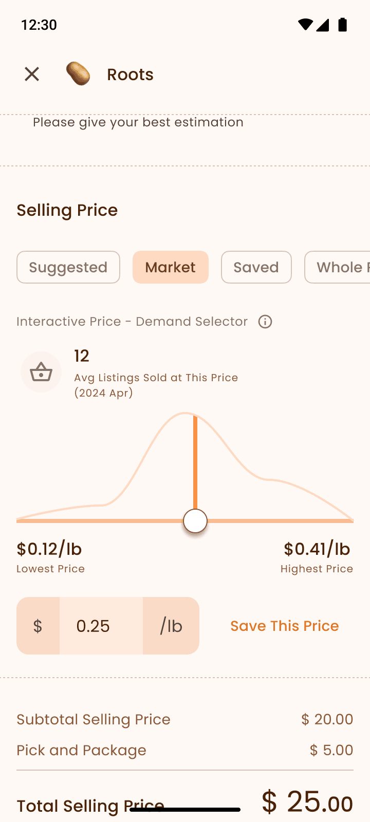
I provided multiple tools to help sellers quickly set prices. Sellers can describe items using flexible units, which the app will convert to a per-pound price for buyers to understand easily. This doesn't impact trading accuracy since the final sale is by total listing price.
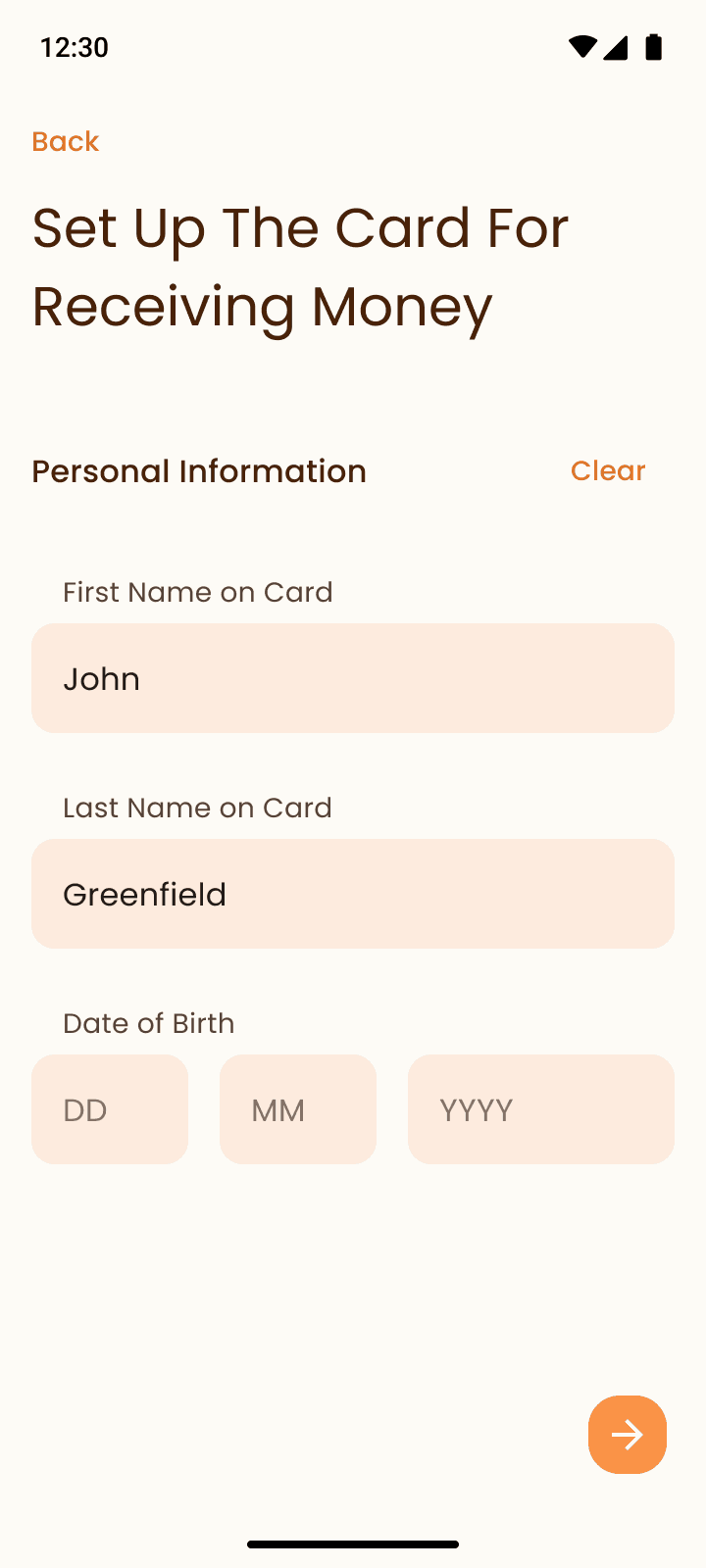
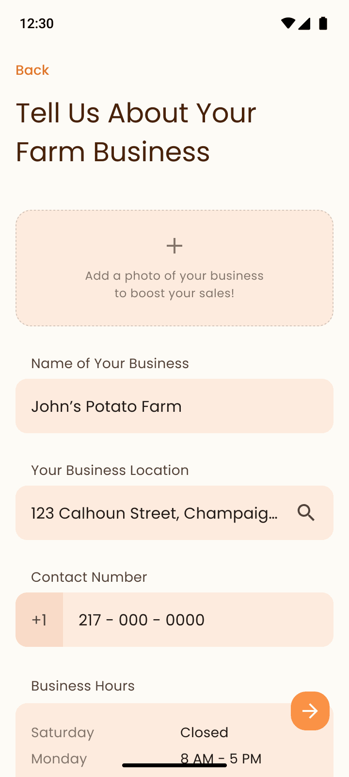
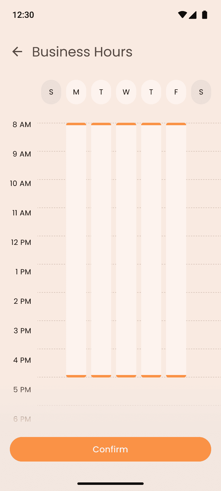
Seller's View: Registration
If you have a MarketMaker account, Harvest Hub can import your information, saving you the time of registering a new account.
I redesigned to make the business hour easy to edit with an intuitive interaction, starting from a default time that most people use.
Buyer's View: Different Views that Help the Procurement
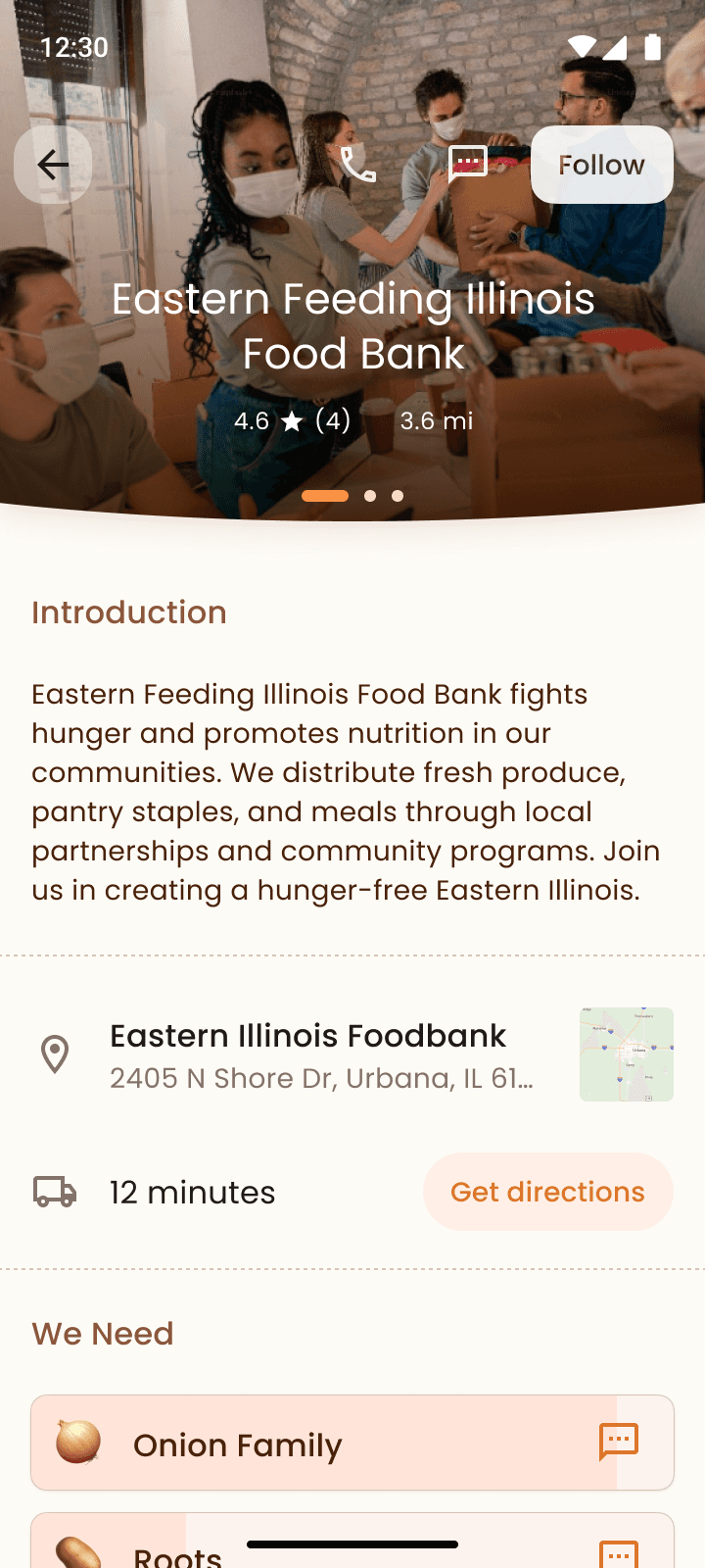
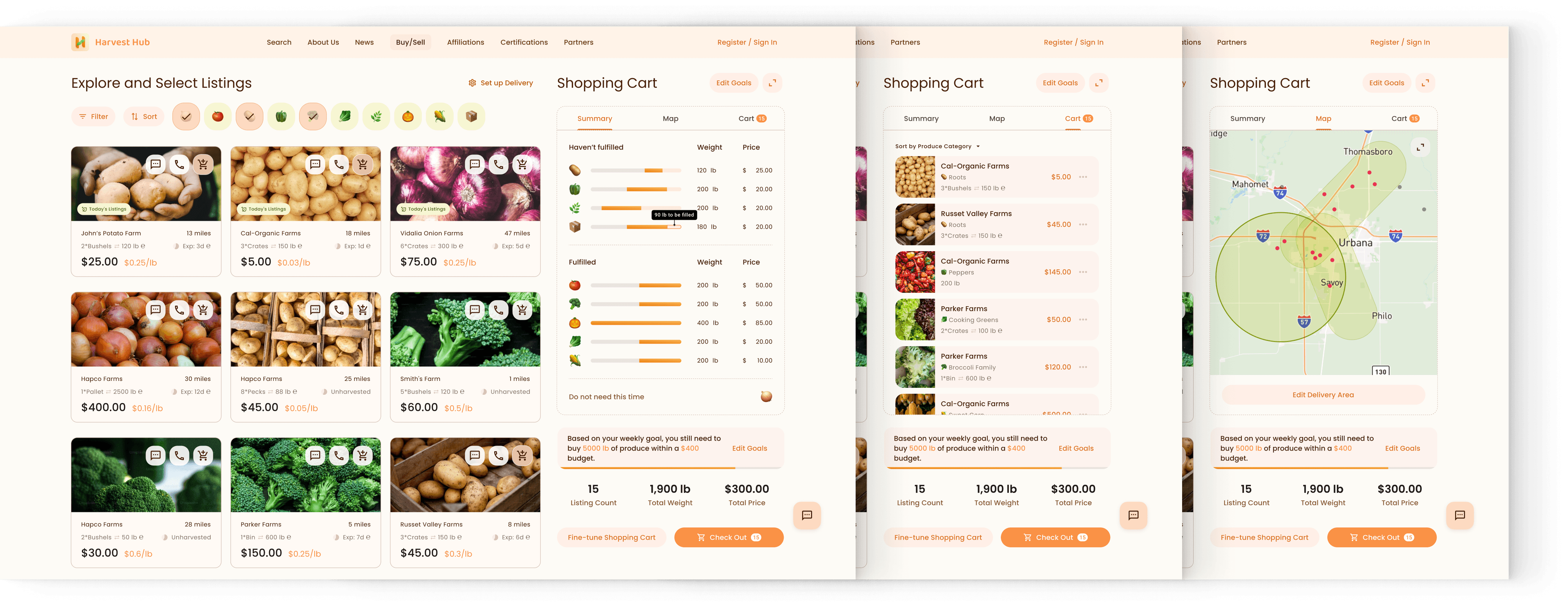
Usually, when Food Banks purchase fresh produce, they often follow a budget list outlining the weekly funds available and the types of produce needed. During the procurement, they track how much produce has been bought and how much is still required. Additionally, they adjust quantities and costs to secure higher-quality procurement, or squeeze out any extra budget to buy supplementary items, such as spices, that add dignity for low-income families.
To support these requirements more efficiently, I provided three different views of the shopping cart, helping to reduce the time Food Banks spend manually navigating back and forth on the Excel spreadsheet.
UX Design 3.2: Incentive System
Challenge Statement
Since the activity this App supports is primarily a charity work, sellers receive only essential compensation for pick & pack, it's crucial to offer sellers positive incentives that fulfill their psychological needs.
Solution
Seller's Contributions and Society Values
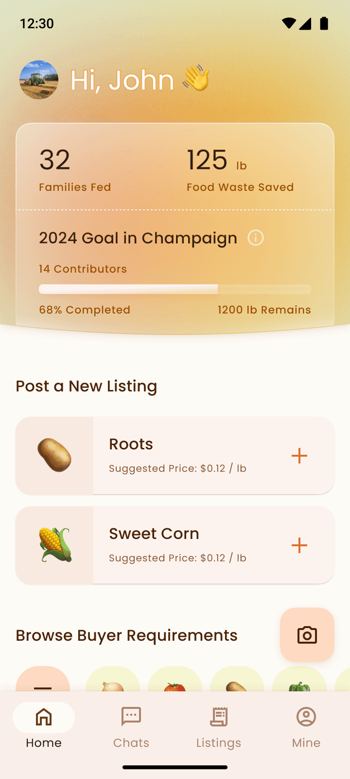
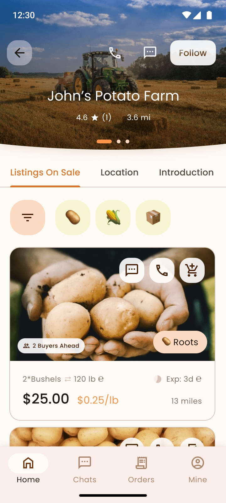
I re-designed the landing page and the seller's profile page to let sellers know their contributions are received, recognized and valued by the community. This is communicated by numbers and a progress bar.
UX Design 3.3: Financial self-sufficiency
Challenge Statement
The initial funding allows this App free to use, but the work group will still need to get further money to make the maintenance sustainable. I designed the "queue" and "donation" features to make this happen.
The Queue System
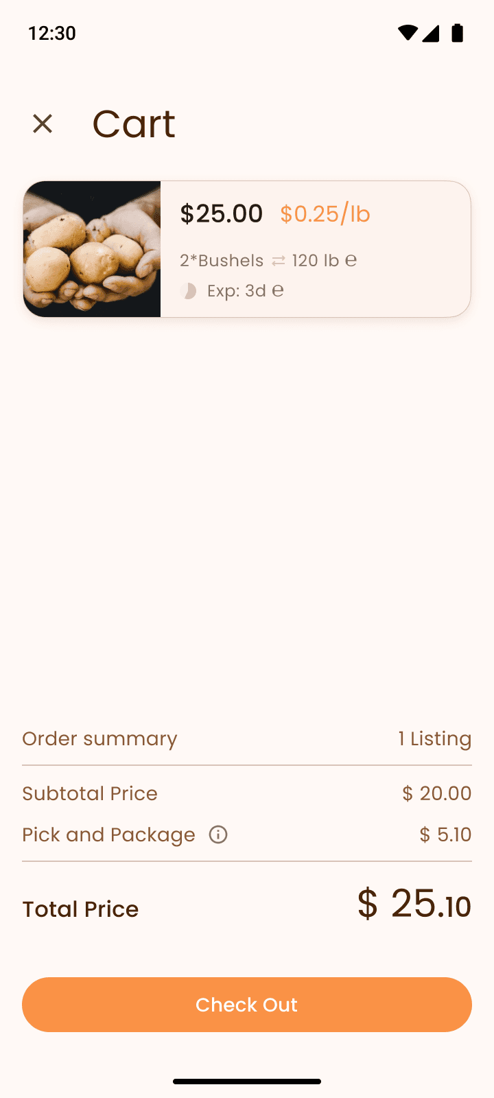
I designed a "queue" system that enables other community buyers to serve as backup buyers, increasing the likelihood that farmers' produce is taken away or being used before it expires, thus sellers get more motivated to sell on this App.
The Donation Options
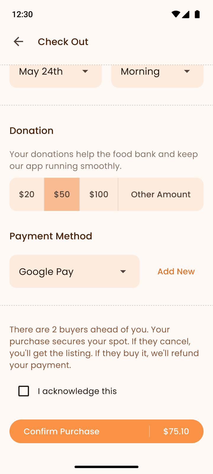
Farmer Buyer's View: Donation at Check Out
I designed the donation feature into the checkout process. Donation works well since it's an app that serves the community, and the local community had a tradition to help each other with charity donations.
UX Design 3.4: Future Scalability
Challenge Statement
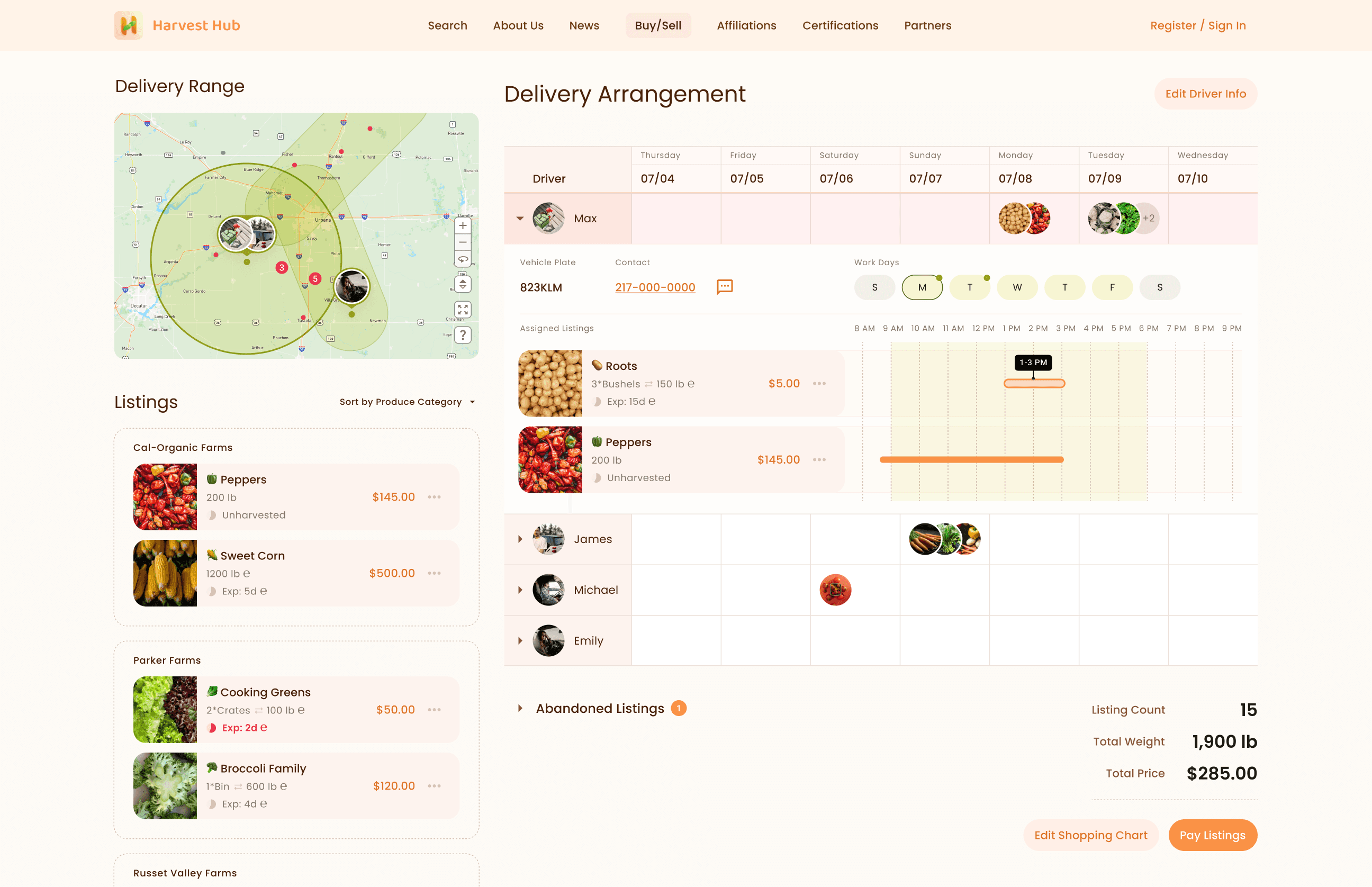
Currently, one food bank will trade with 15 specialty farms per week, they will need to manage the delivery.
However, stakeholders like food pantries, external drivers, and farm volunteers will affect the delivery management. Interviews and the feasibility estimation suggested that factors such as transportation routes, time efficiency, and volunteer availability could be improved by their involvement.
Solution
I designed the current app to be adaptable, allowing for potential integration with future individual apps for these stakeholders, while keeping the minimal actions to do some of the delivery management.
The current design supports basic delivery management, allowing buyers to assign listings to multiple delivery men and adjust the assignment based on geographical convenience and each delivery man’s availability.
In the future, this process could be partially automated, incorporating delivery men’s preferences, work time, and vehicle capacity. Further more, this app could incorporate farm volunteers and food panties, to best manage the real time produce supply and demand. However, charity buyers will still have the option for manual adjustments to resolve conflicts or achieve a more customized management approach.
Phases End
My Reflections
Proactive problem framing
I realized that, as a UX designer, I can collaborate with the project owner to frame the problem together, rather than simply accepting their decisions.
At the beginning, the product owner provided personas that are intrinsically contradictory and hardly help design decisions. I reached out to her and found she didn't work with a UX designer before, that's why she didn't know the right estimation of my workload, nor the information I need from a persona. This made me realized that I can challenge the decisions since I brought a unique perspective as a designer, and being transparent about my work helps the project be more realistic.
Finally, I worked together with the product owner to understand the consensus of stakeholders and the conflicts between ideas, considered the resources and the timeline, and finally suggested to start designing from the one use case, the trading between food banks and local farmers, to better align with the ultimate goal, reducing surplus produce from the fields.
Numbers and competitive analysis are great supportive resources to decision making in the early phases
Defining the high-level goal of a project typically goes beyond the core responsibilities of a UX designer. However, if the product manager hasn’t fully addressed this, it's still within my scope to help. If the product manager provides any supportive reasonings, I can contribute by proposing ideas based on the materials; even if there's literally nothing, I can still make an estimation based on open access resources. This process requires a lot communications and and validation to frame the issue itself, question uncertainties, and find the facts.
Personas don’t come from a vacuum, they are a summary of research findings.
The persona charts made my design process much more efficient, I don't have to worry about missing any points, or rely too much on my biased and loose intuitive memories of the interviews.
I learned to use Material You design system
I like the look and feel of Material You, it offers peaceful, welcoming, and simple feels. However, I personally think it fits recreational or simple tasks. For work related, complex or informative cases, it's very hard to be consistent with the visual idea, since Material You requires spaces and sense of form a lot, while these cases usually need a tight spacing to guarantee effectiveness. I'd love to keep track of new cases that other designers use Material You and learn more about it.

