Harvest Hub Phase 1 & 2
Phase 1
Jul. - Dec. 2022, 40% FTE
Challenge 1.1
Challenge Statement
Here are 2 dominant problems that help frame the challenge to address:
Decide the approach to achieve the ultimate goal, to reduce food waste
Choose the target buyer and seller for MVP
Actions
I communicated with the team based on the initial ideas and personas the product manager first provided. The primary idea was to narrow down the scoping due to the time and resource constrains.
General rationale for MVP
The ultimate goal is to reduce food waste. Our client initially sensed an opportunity to optimize the delivery of fresh produce, but the team lacked the knowledge and resources to change the delivery services. As a result, the team took a step back and focused on leveraging the food requirements of food banks to digest surplus produce from the fields.
So we defined the approach as "reducing food waste by facilitating produce trading between food banks and local farmers".
Target users for MVP
After reviewing the personas our product manager first provided, 2 types of buyer and 2 types of seller were listed, but some are questionable:
Buyers:
Middle-aged, mid-high socioeconomic class living locally - we don't access to delivery solutions to make retails happen.
Individual in charge of food procurement for a food bank - good choice, as they recently received funding to make the produce procurement happen, not just receiving donations.
Sellers:
Distribution Manager at dairy processor - extra dairy products are often processed by factories to extend shelf life, so they rarely have surplus food that goes to waste.
Specialty farmer that normally sells produce at the local farmers’ market or to local restaurants - they have the fresh produce food banks need. However, they usually do not have enough surplus, food banks need to trade with tons of specialty farmers to meet the requirement.
So we chose a relatively reasonable pairing of seller and buyer: the food bank as the buyer, and specialty farmers as the seller.
Further Actions
There are still many aspects worth questioning, and no one on the team can confidently say they fully understand the users. Therefore, I proposed to conduct user interviews to gain deeper insights while delivering the UIX design based on the current assumption.
I led to plan and conduct 12 exploratory semi-structured user interviews with two co-workers. I led 8 of these sessions. Due to the tight timeline for submitting visual deliverables in this phase, I wasn't able to conduct an in-depth data analysis to synthesize the interviews. Instead, I documented the interview notes and raw data.
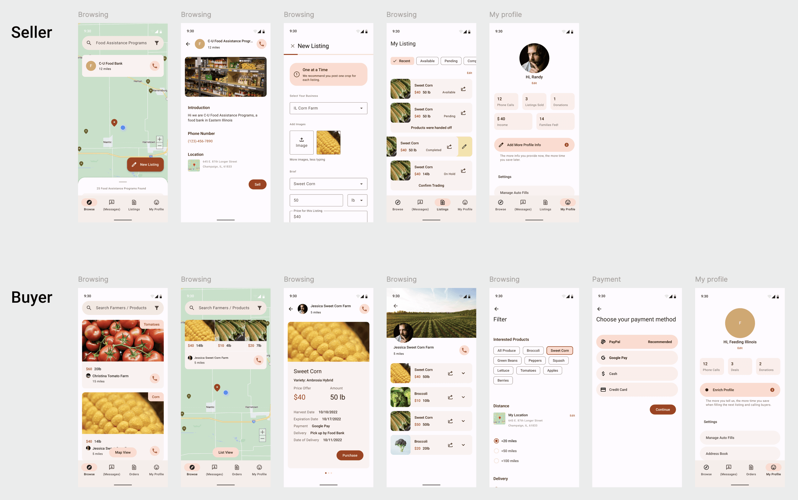
I delivered an Android-based app design for both the seller's and buyer's ends based on the gut understanding of the interviews and the project manager's strategic vision. I focused on designing alternative for the listing and payment flow.
Challenge 1.2
Challenge Statement
How to build the framework of the product?
Actions
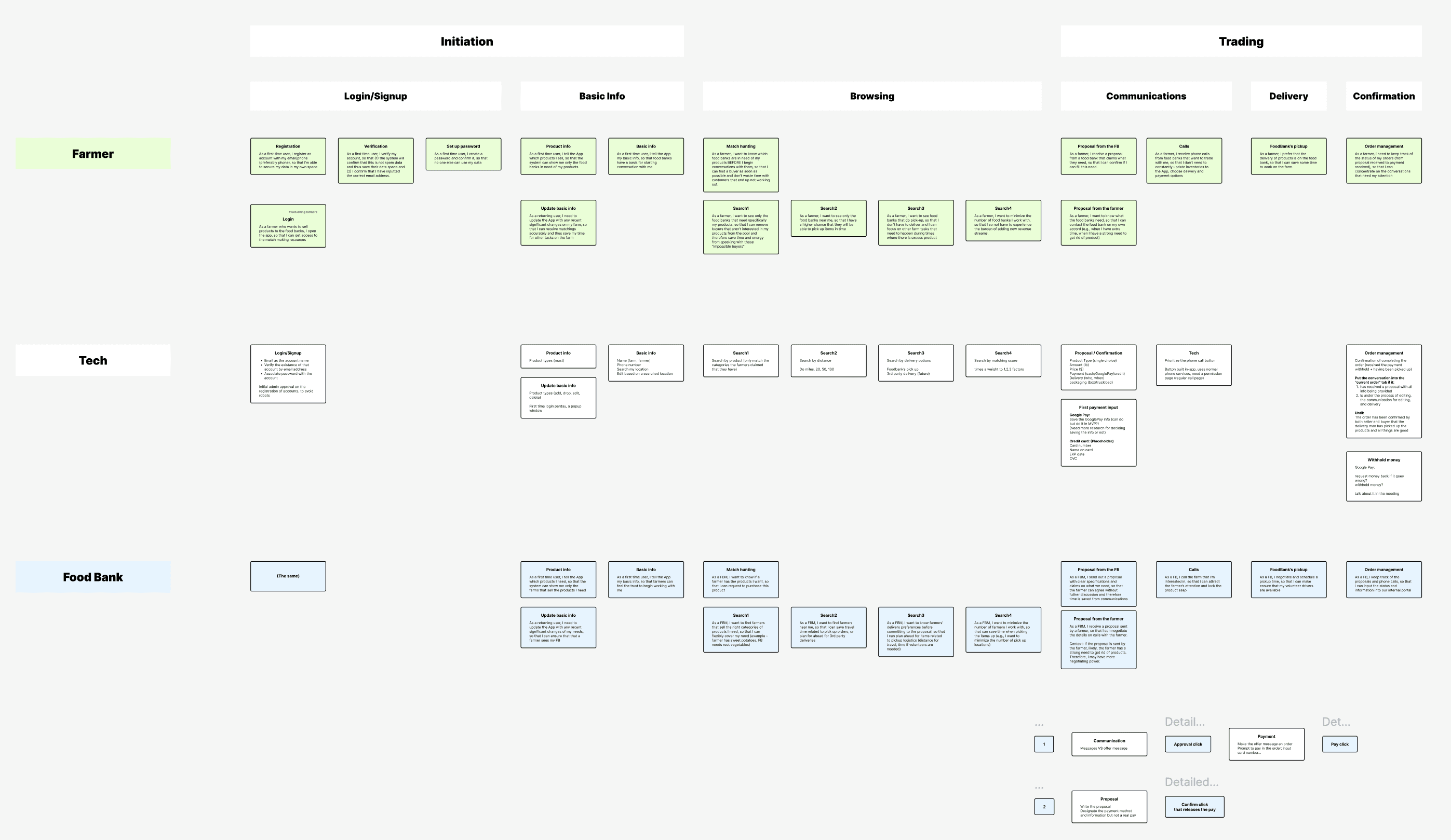
I proposed actions that will be taken by sellers, buyers, and what the app provides into a service blueprint.
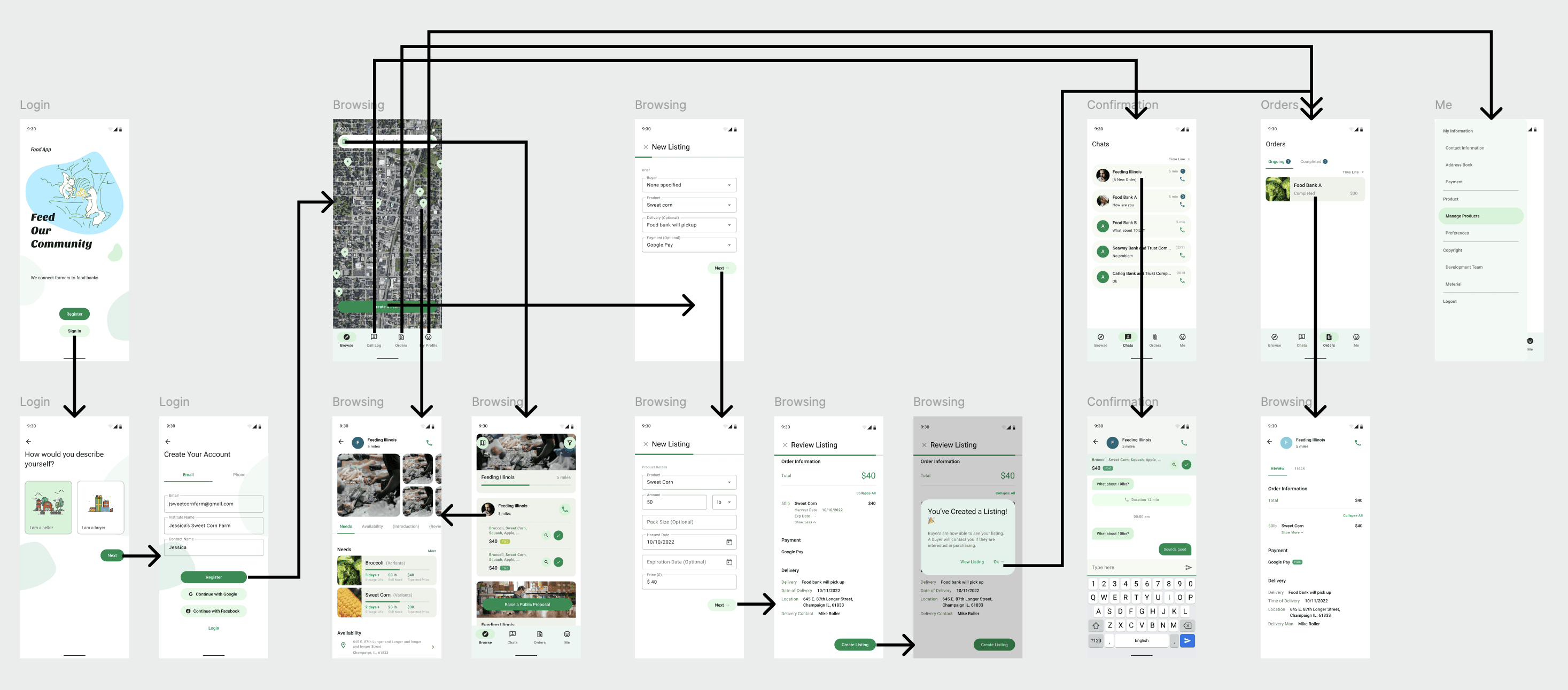
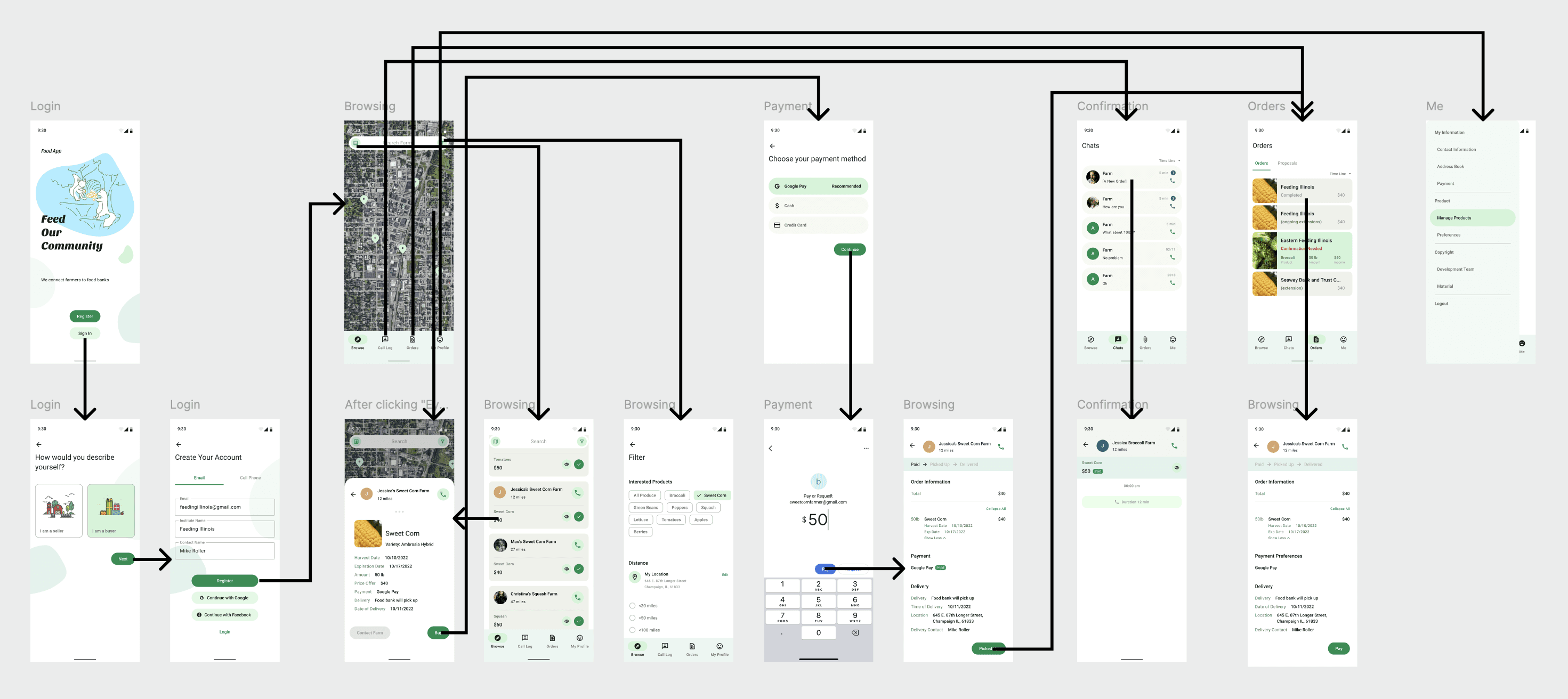
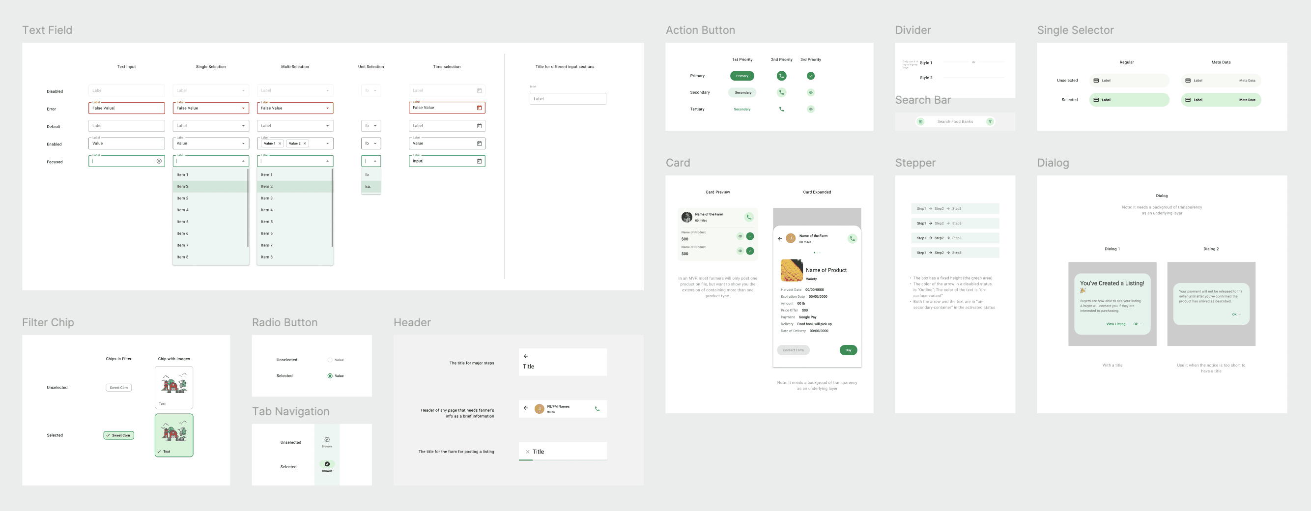
I designed the wireframe and information architecture for the workflows.
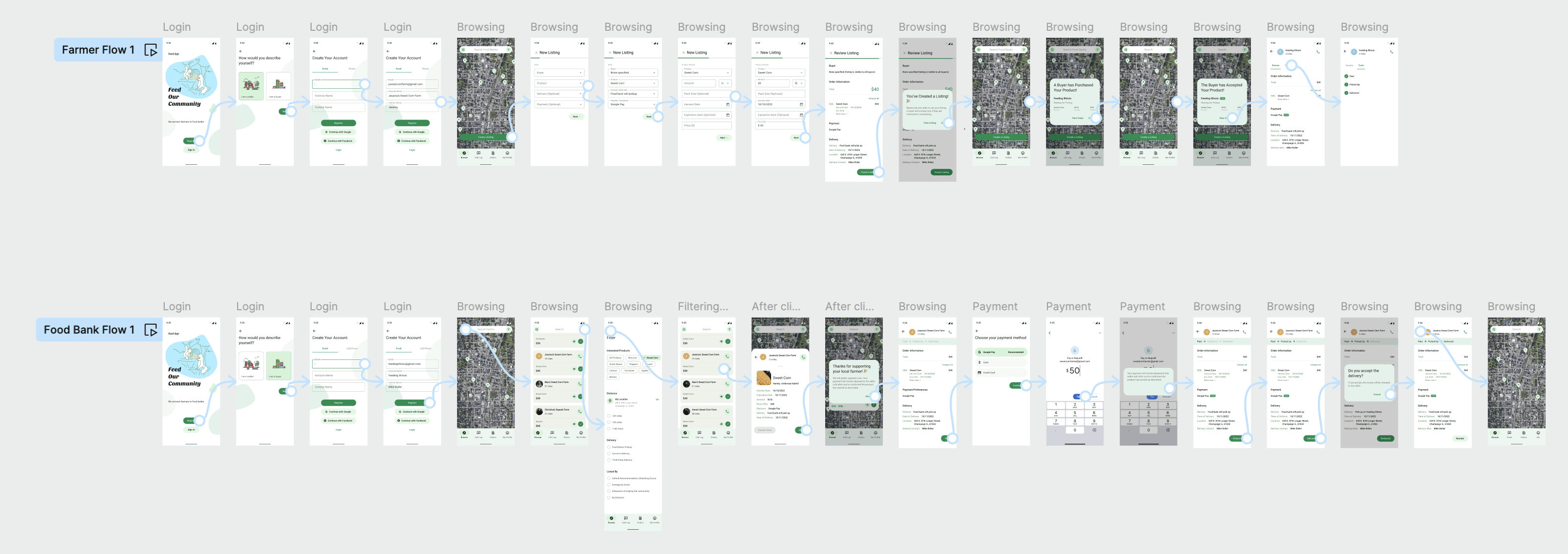
I delivered the key workflow that prioritize to be implemented.
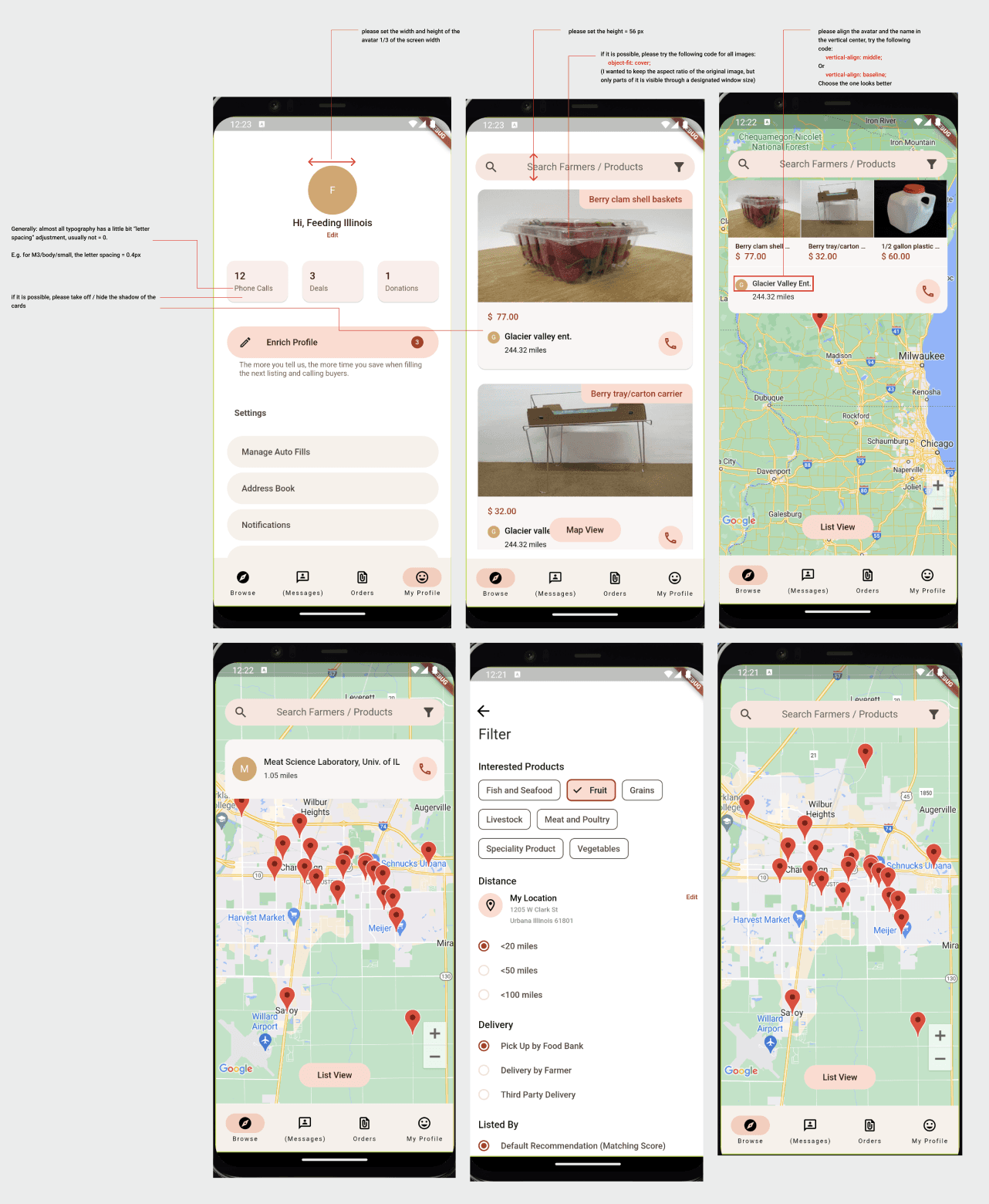
I delivered handoffs for UI designs
UX Solutions
Service blueprint
Information architecture
Seller flow
Buyer flow
Key workflow
Handoff
Phase 2
Mar. - May 2023, 20% FTE
Challenge 2
Challenge Statement
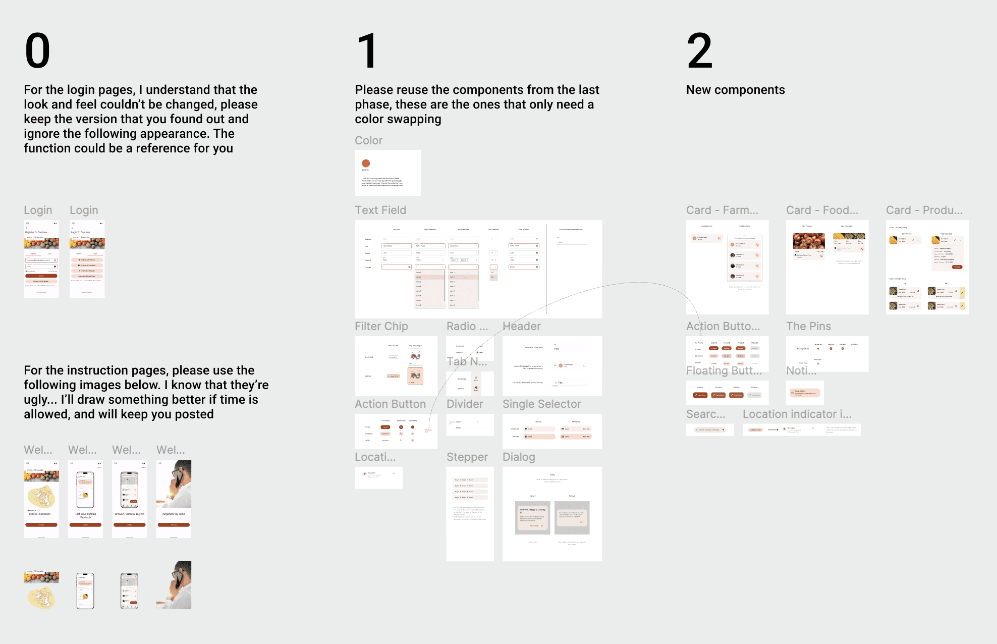
Due to the limited timeframe, the project owner brought in another team in our organization, MarketMaker, which had developed a system focused on a similar topic: connecting all local food related entities through a web app. This collaboration aimed to save time by avoiding the reinvention of certain backend infrastructure and information collection.
So the design challenge is: How to merge MarketMaker's branding with Harvest Hub?
Actions
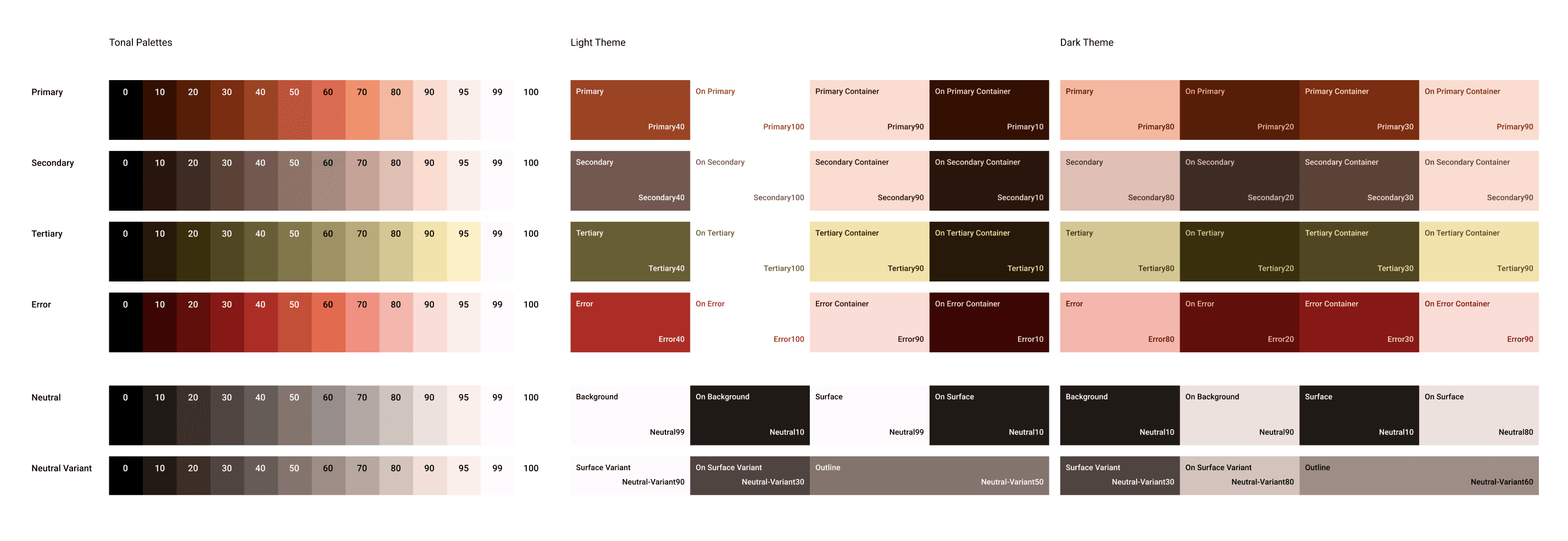
(Figma Variables is still unreleased by then, what a pity) I created a new color token system, and re-applied the tokens to the interfaces. Besides, I also conducted internal user tests, thus I improved a few features and designs under the previous framework.
The existence of this phase was primarily for developers to implement the designs and launch the App on Google Play. So I went through design auditing with developers.
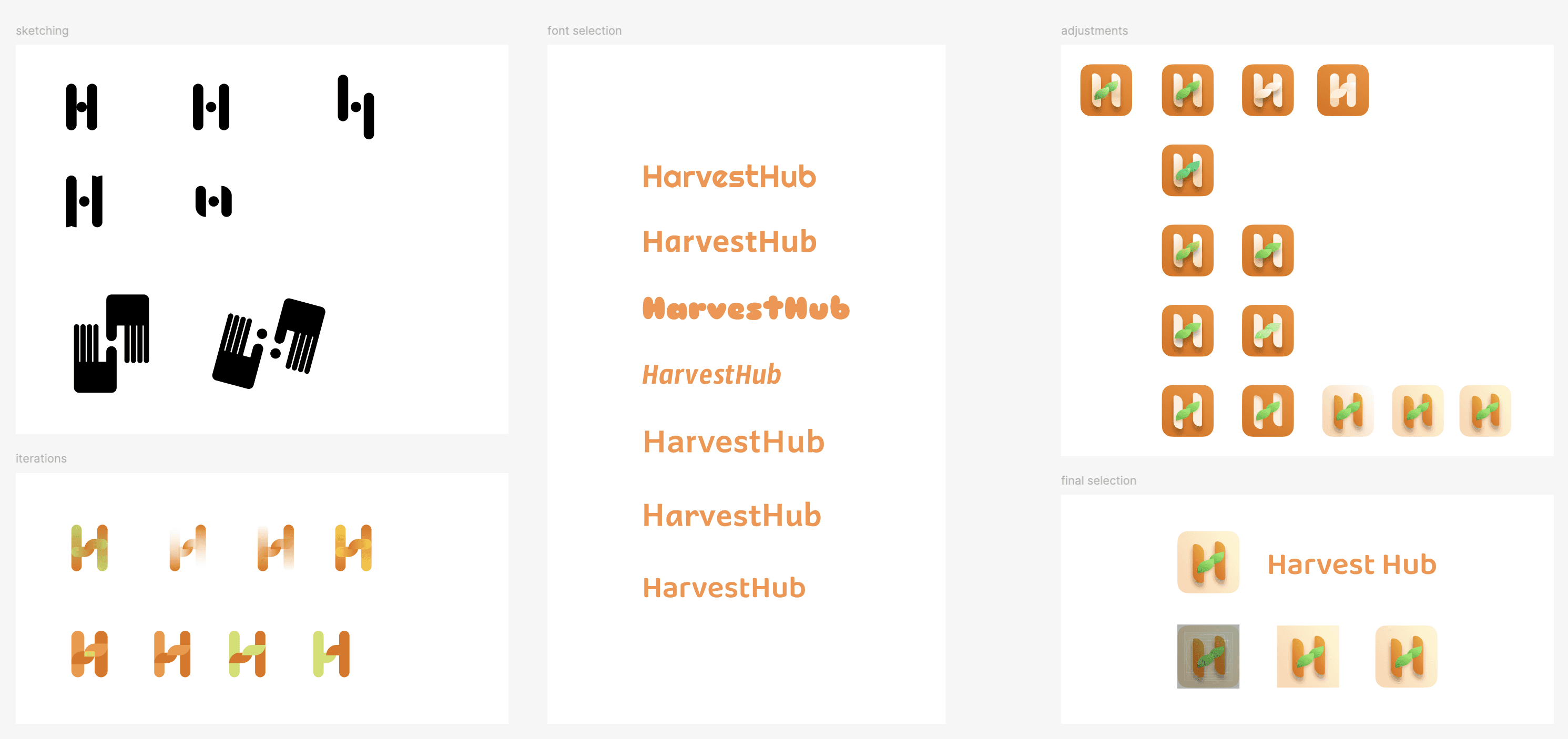
I also made a icon (logo) to launch the App. But unfortunately time was limited so the better version wasn't launched.
UX Solutions
New theming
Design auditing
Icon (logo) design
I decided to use a lighter orange color since the previous orange Material You color palette generated was too murky. I decided to further improve the color scheme starting from this icon, but the rest of UI changes will be done in the next phase.
Continue reading about phase 3

