# Design RESEARCH
Bio Informatics
Design Research
SaaS (B2B)
0-1
Web
Product & Solution
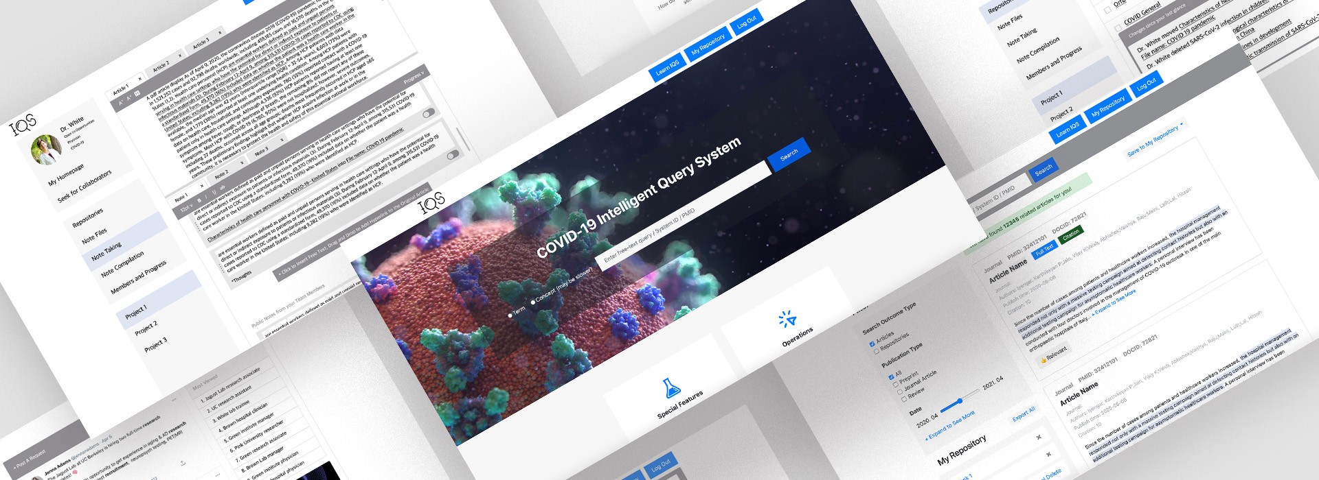
Design and Evaluation of a COVID-19 Literature Search Engine that Supports Collaborative Information Seeking
Why this topic?
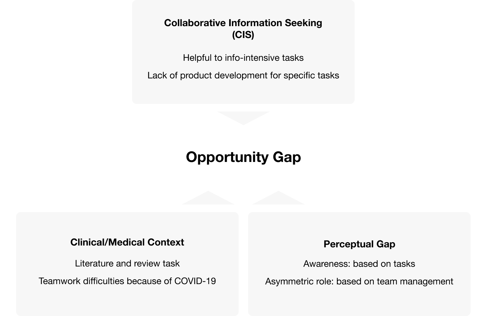
The COVID-19 pandemic has changed the way clinical/medical researchers work together. Yet, there is no collaborative search feature applied to any of the literature search product. In addition, researchers are in need of finding the latest COVID-19 related literature. Then how might we develop such a product to support research teamworks?
TOPIC
Information Science
Online Teamwork
From a design perspective
TOOL
Data Collection Tool: Google Form, WebEx audio and screen recording, Miro
Data Analysis Tool: NVivo, Excel, Qcamap.org
METHOD
Research Method: Prototyping, semi-structured interview, survey, SUS scale, heuristic evaluation, usability test (convenience sampling)
Data Analysis Method: Qualitative coding (open coding - focused coding - thematic coding), statistical calculation (mean & standard deviation), affinity grouping
A thorough research description ahead,
Want to jump the design directly?
Read Designs
Introduction of the topic and domain | Literature review
Collaborative Information Seeking (CIS) Can Help Clinical/medical Research Teams
Expected Outcome
Information Query System (IQS) interaction and user interface design.
Research Method
User study that learn the big picture of online teamwork, instead of the traditional calculation of algorithm efficiency.
Research question
How might a user interface design for the literature collection and review task bridge perceptual gaps between clinical/medical research team members?
Q1: How can CIS complement the interaction and user interface design to assist bridging the perceptual gap between team members?
Q1-1: What is the literature collection and review process like in a clinical/medical team?
Q1-2: How to understand the roles in the clinical/medical literature collection and review?
Q1-3: How to improve innovation efficiency by providing awareness?
Q2: How might we improve the proposed prototype system?
Q2-1: What are the usability issues?
Q2-2: How might we fix them?
Method
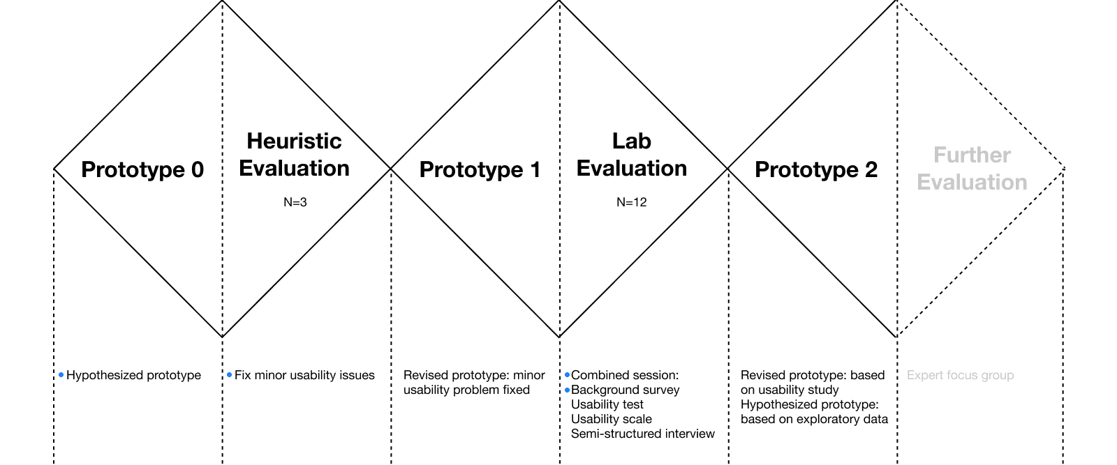
An Iterative Process: Prototyping - Evaluation
Data Collection
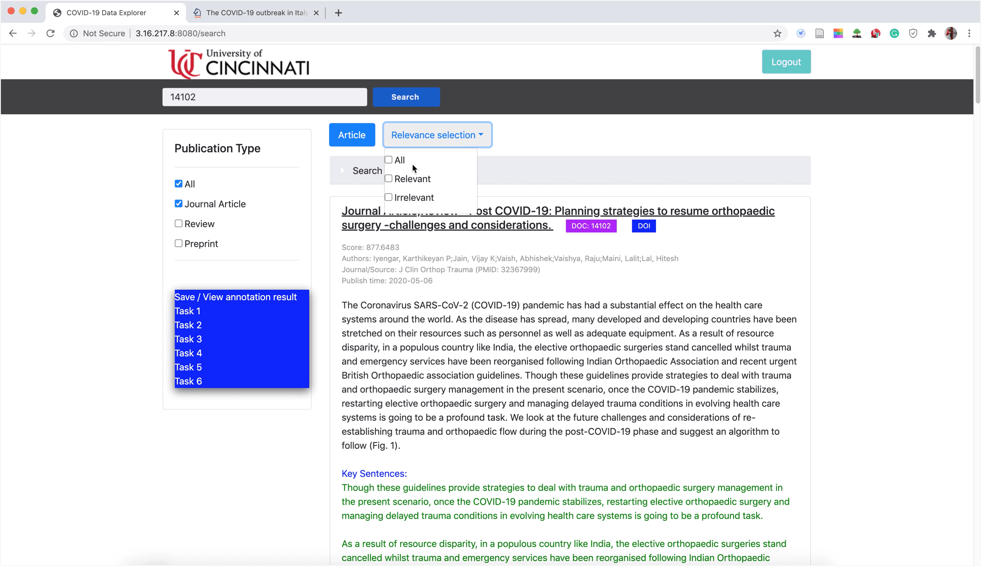
Design: prototype 0
The Best Guess of A Search Engine Infrastructure
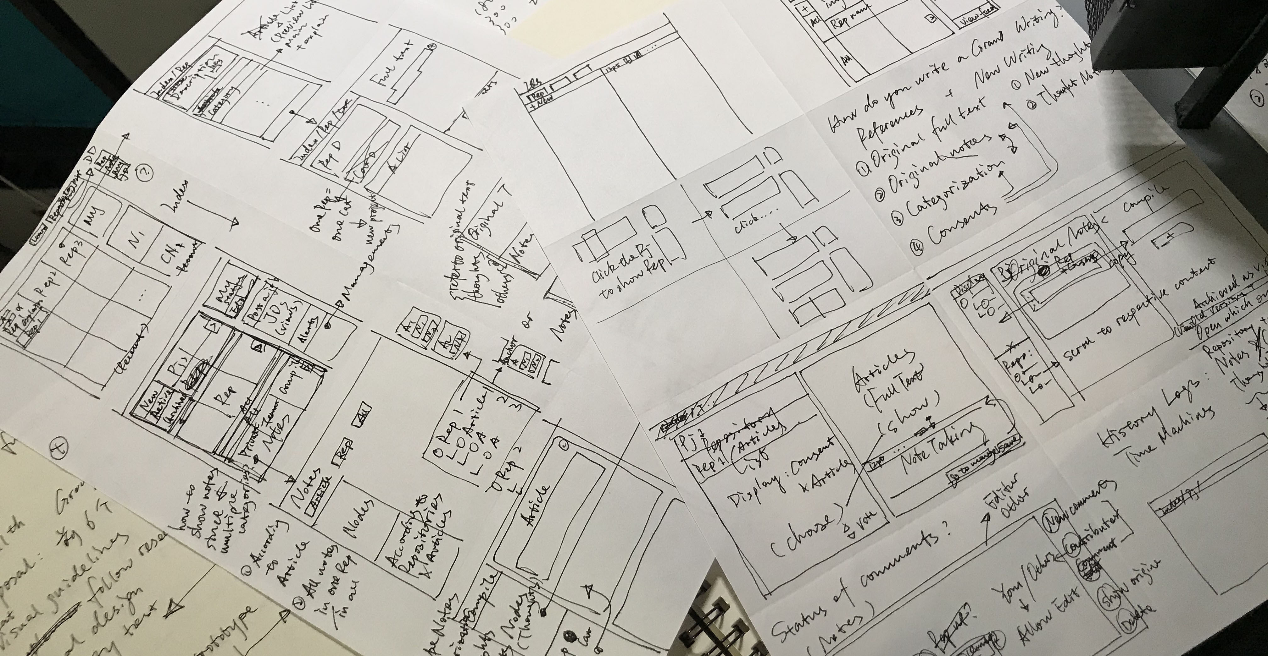
Drafting
Wire-frames and Design : BootStrap Studio: HTML framework + CSS
Implementation : Clickable with back-end algorithm
Evaluation: prototype 0
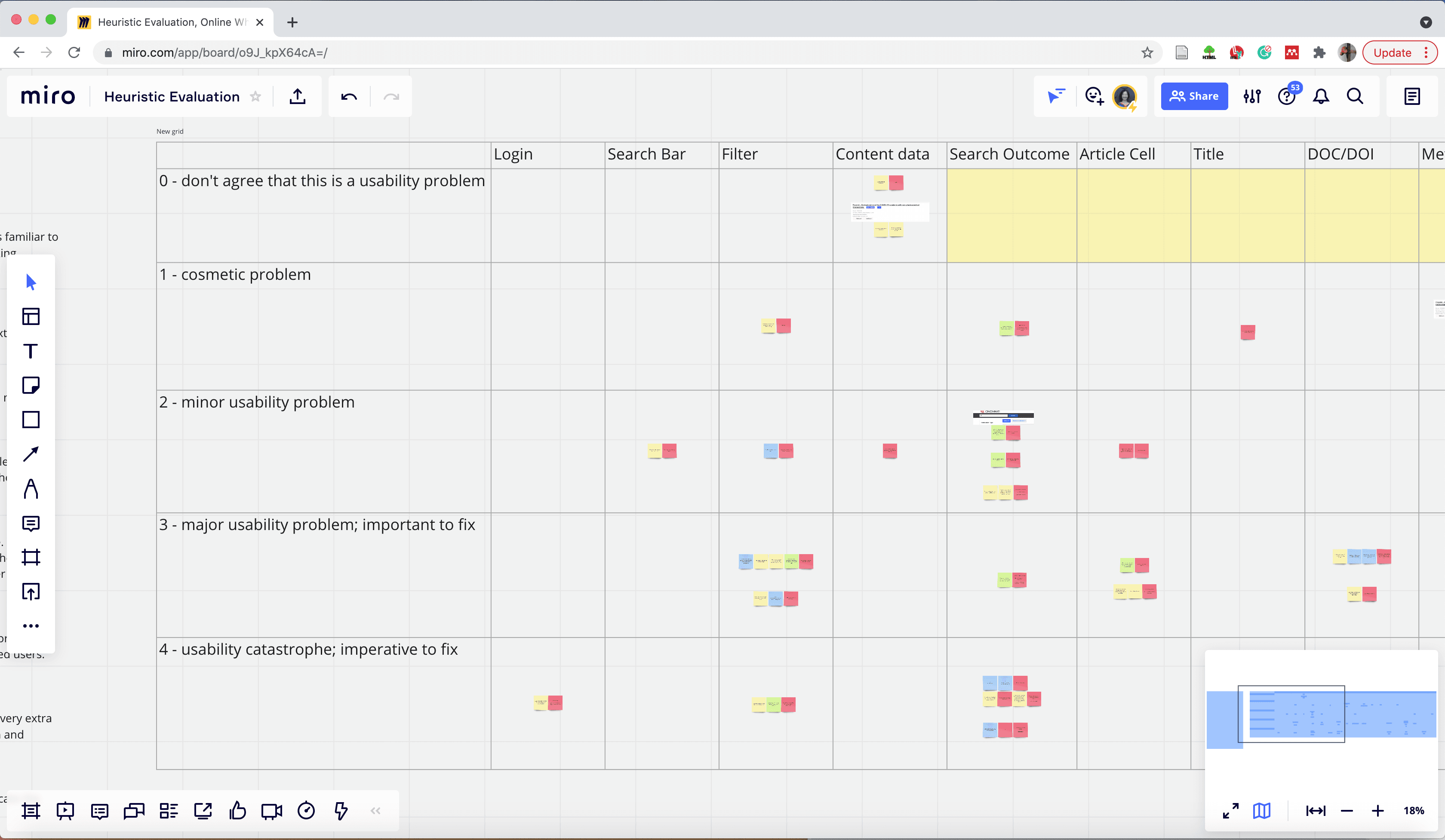
Heuristic Evaluation: To Fix Minor Usability Issues
Aim
To spare more time and keep participants focused on key issues during the lab evaluation, I decided to conduct a heuristic evaluation first to address basic usability problems.
Recruitment
Design experts with a learning background in DAAP, N=3
Steps
Individually find usability problems as much as possible
Group brainstorm : share problems and propose design ideas
Design representative talk with development team to list development priority
Online Session : Miro + WebEx
Data Analysis : Affinity grouping according to a criteria of seriousness
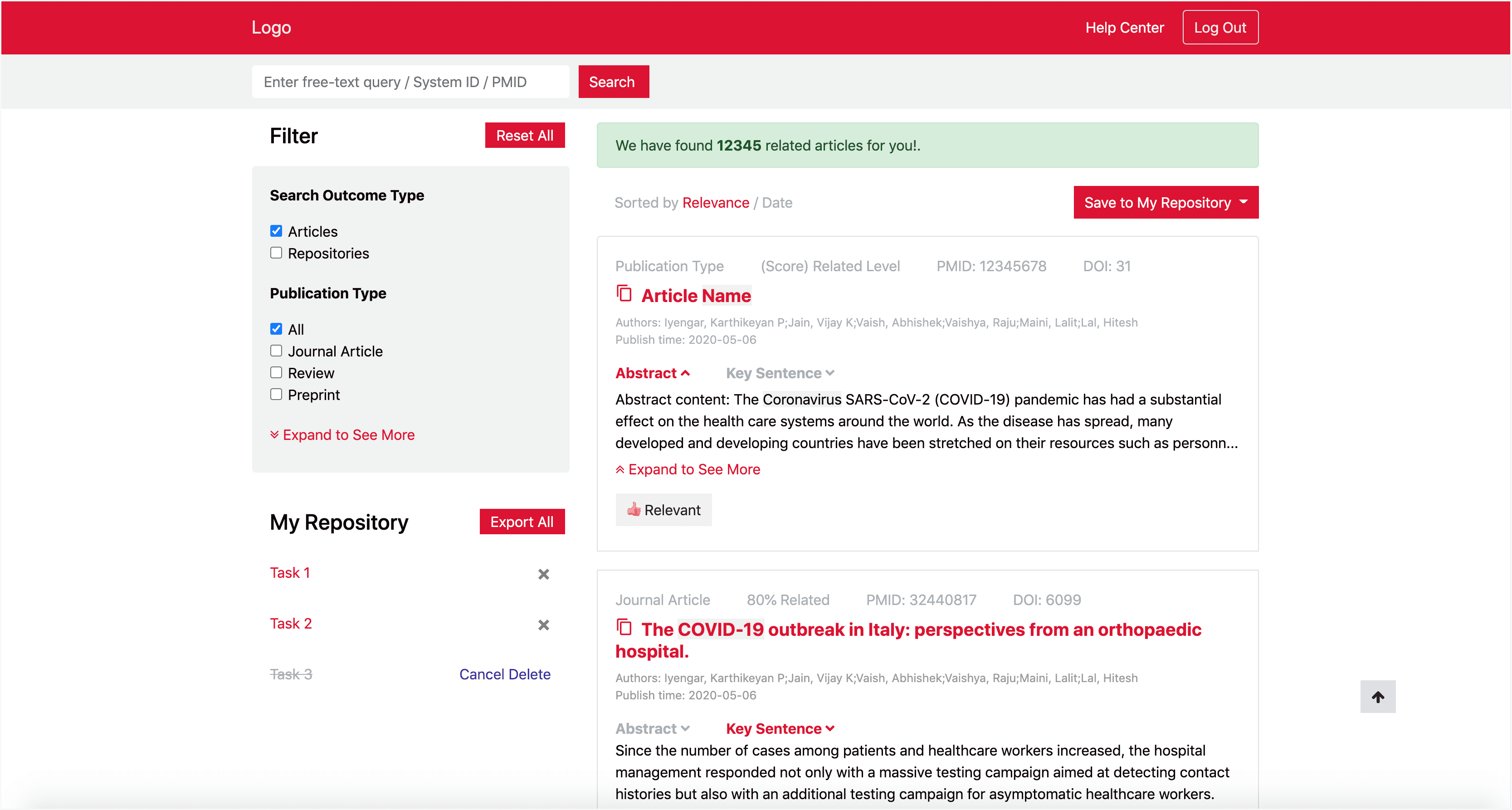
Design: prototype 1
Minor but Important Issues Fixed
The key findings are
The gap between the design deliverable and the front-end implementation.
Pure technical issues.
Neglecting general human reactions.
Less consideration of using scenarios.
Dilemma of introducing specialty of the IQS.
Final Decision
High priority: minor but important usability issues. Low priority: functions related to CIS
Design
Implementation
Evaluation: prototype 1
Lab Evaluation: A Combined User Study
Aim
To learn from the user and reduce the recruitment difficulty
Recruitment
Researchers in College of Medicine: professor, associate professor, Graduate Research Assistant, Librarian Fellow. N=12.
Steps
Background Survey
Usability test: Realistic Tasks + SUS Scale
Semi-structured Interview
Tools
Google Form
WebEx
WebEx Audio and Screen Recording
Background Survey
Aim
Collect demographic information for the lab evaluation
Collect search behaviors and collaboration behaviors
Supportive evidence due to limited sample size
Steps
Demographic info
Search behavior
Collaboration behavior
Data Analysis
Statistical charts
Results
Top choices. References for the further lab evaluation result because of its small size.
Usability Test: Realistic Tasks + SUS Scale
Aim
Learn usability issues from user’s perspective
Steps
PubMed search: search behavior observation
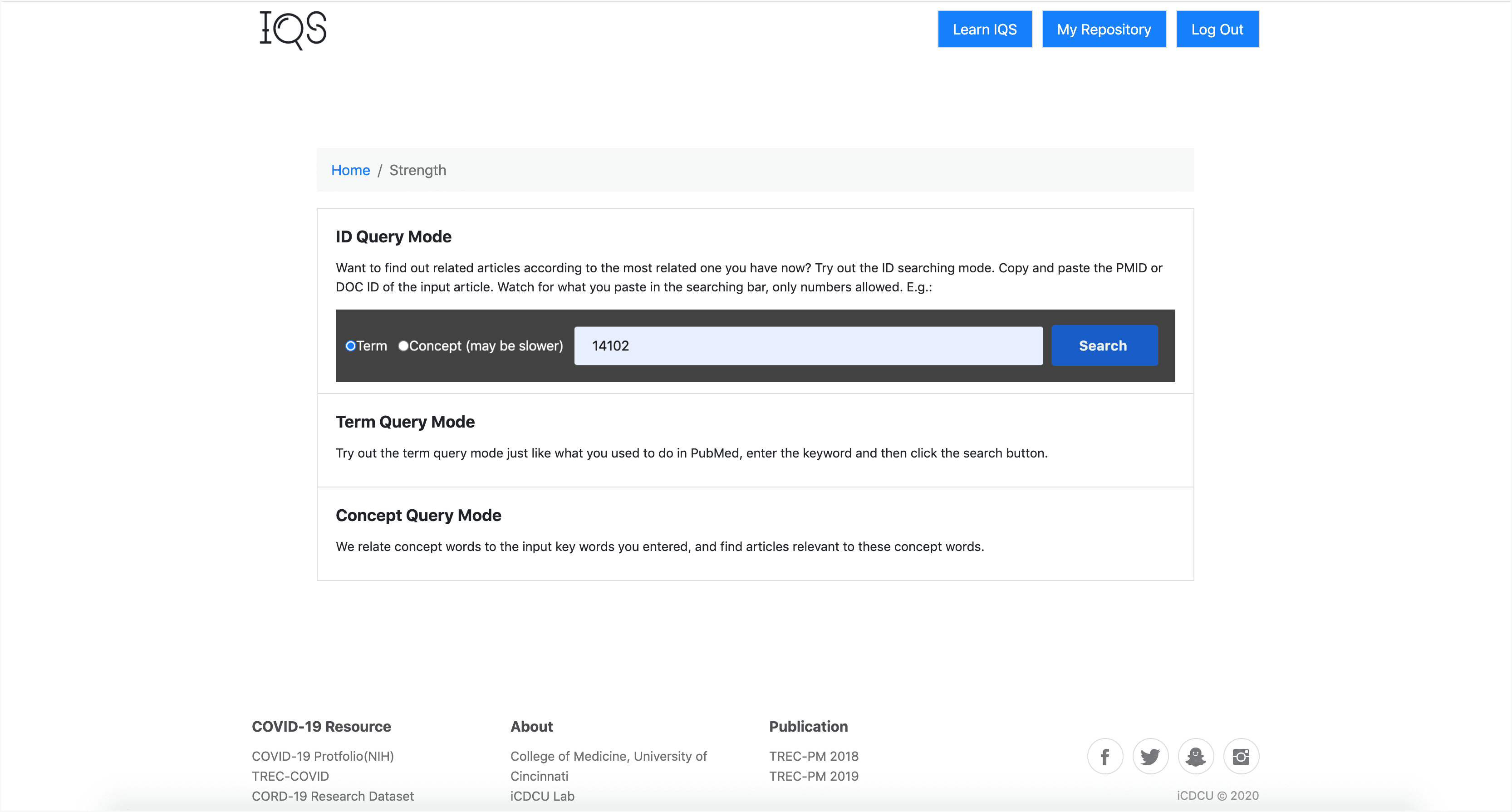
Search with IQS system: keyword+term, ID+term, ID+concept
Semi-Structured interview: user perspective usability
Usability scale: SUS scale
Data Analysis
Data of realistic tasks : Usually: completion of tasks. This study: qualitative coding (open coding + focused coding)
Data of SUS scale : Mean + standard deviation calculation
Online Session
Findings from realistic tasks
The user’s mental model
The understanding of IQS from a user perspective
The malfunction
Visibility of system status
The matching between system and the real world
The user control and freedomLow Readability
Recognition rather than recall
Aesthetic and minimalist design
The visibility of system status.The system error
A simple collection of implementation problems occurred
Result from SUS scale
A SUS score above average (current IQS is doing ok and could be improved)
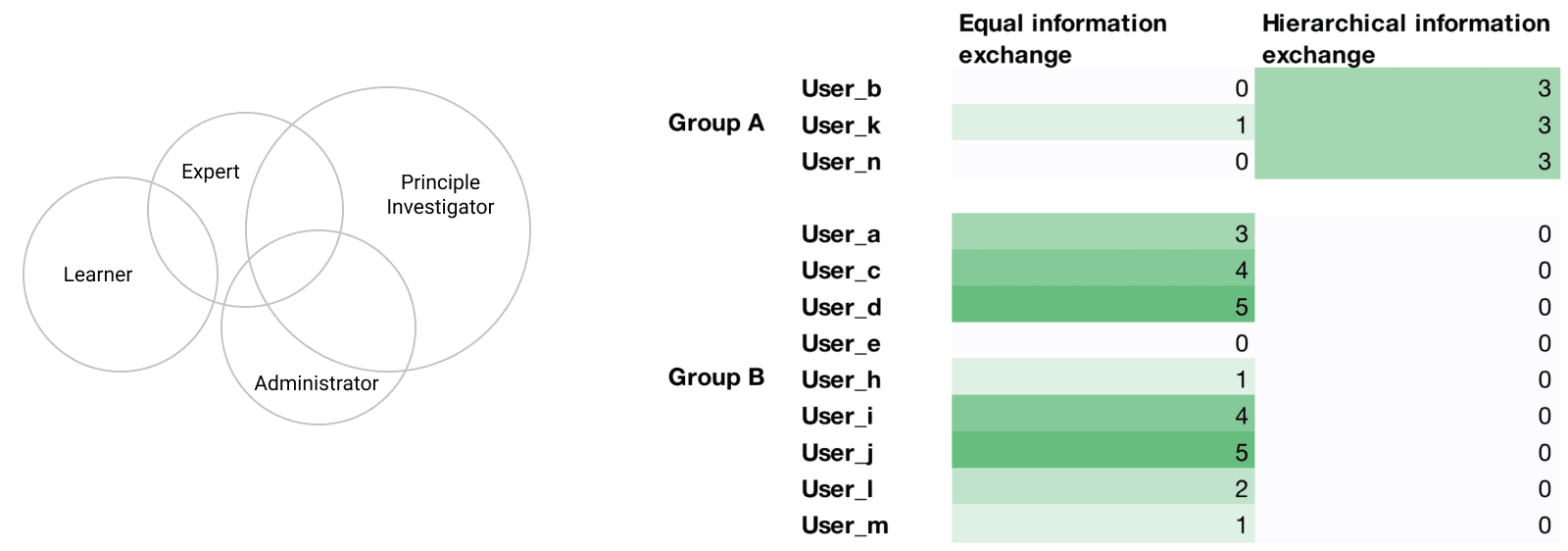
Emerging categorization: group A vs group B (helpful for the following sections)
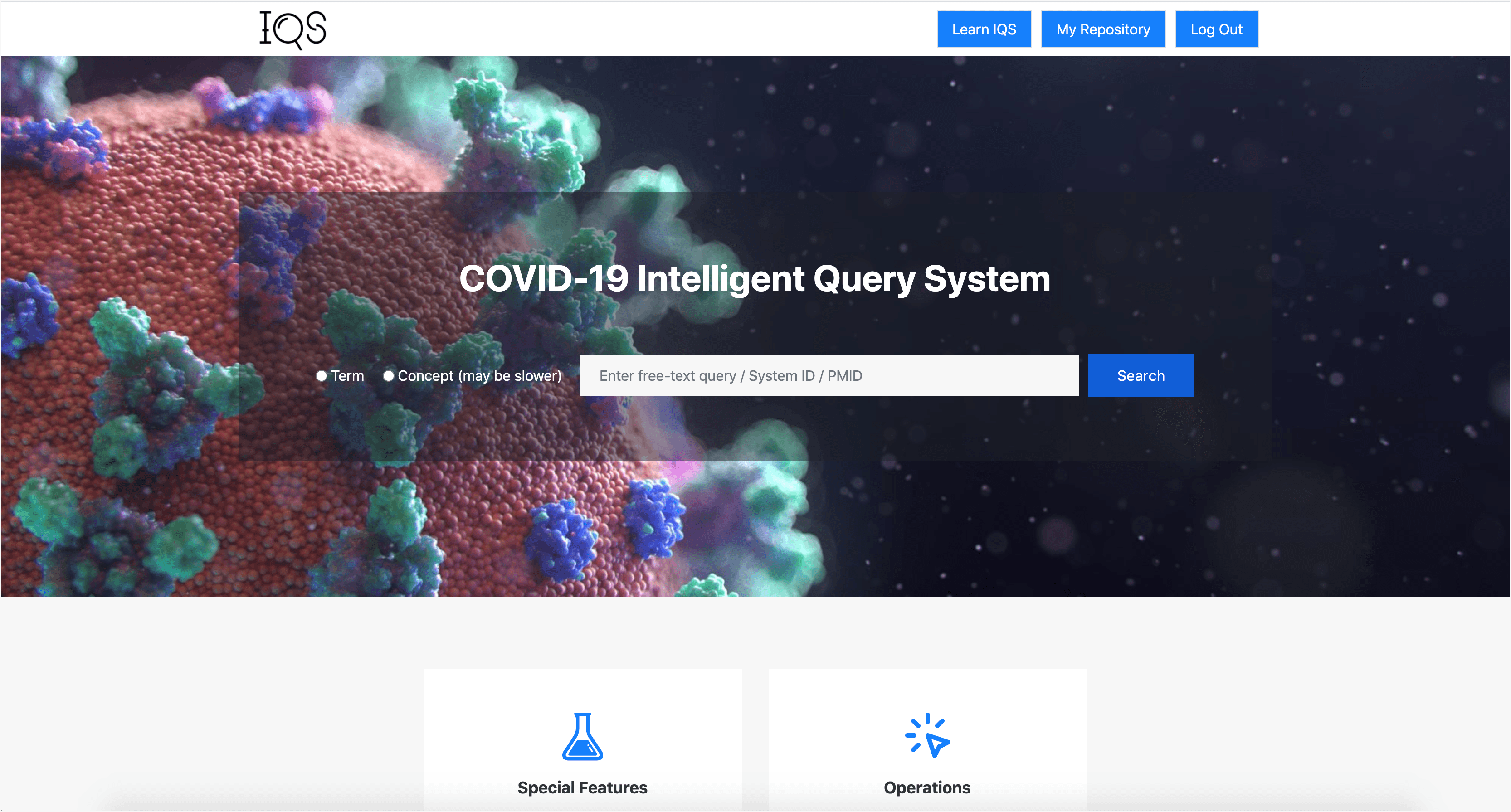
Design: A part of Prototype 2
Based on Usability Test Results
Login page
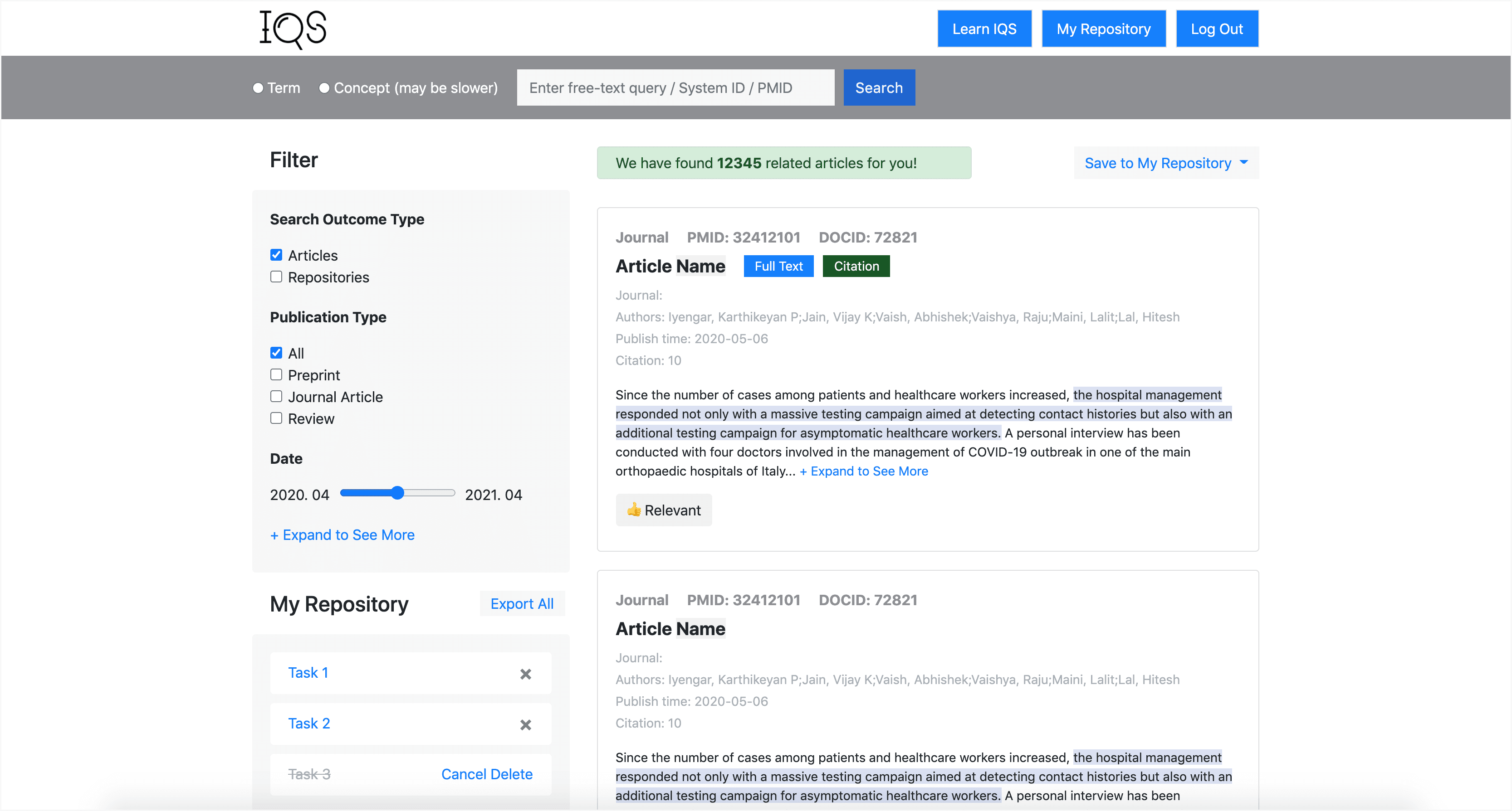
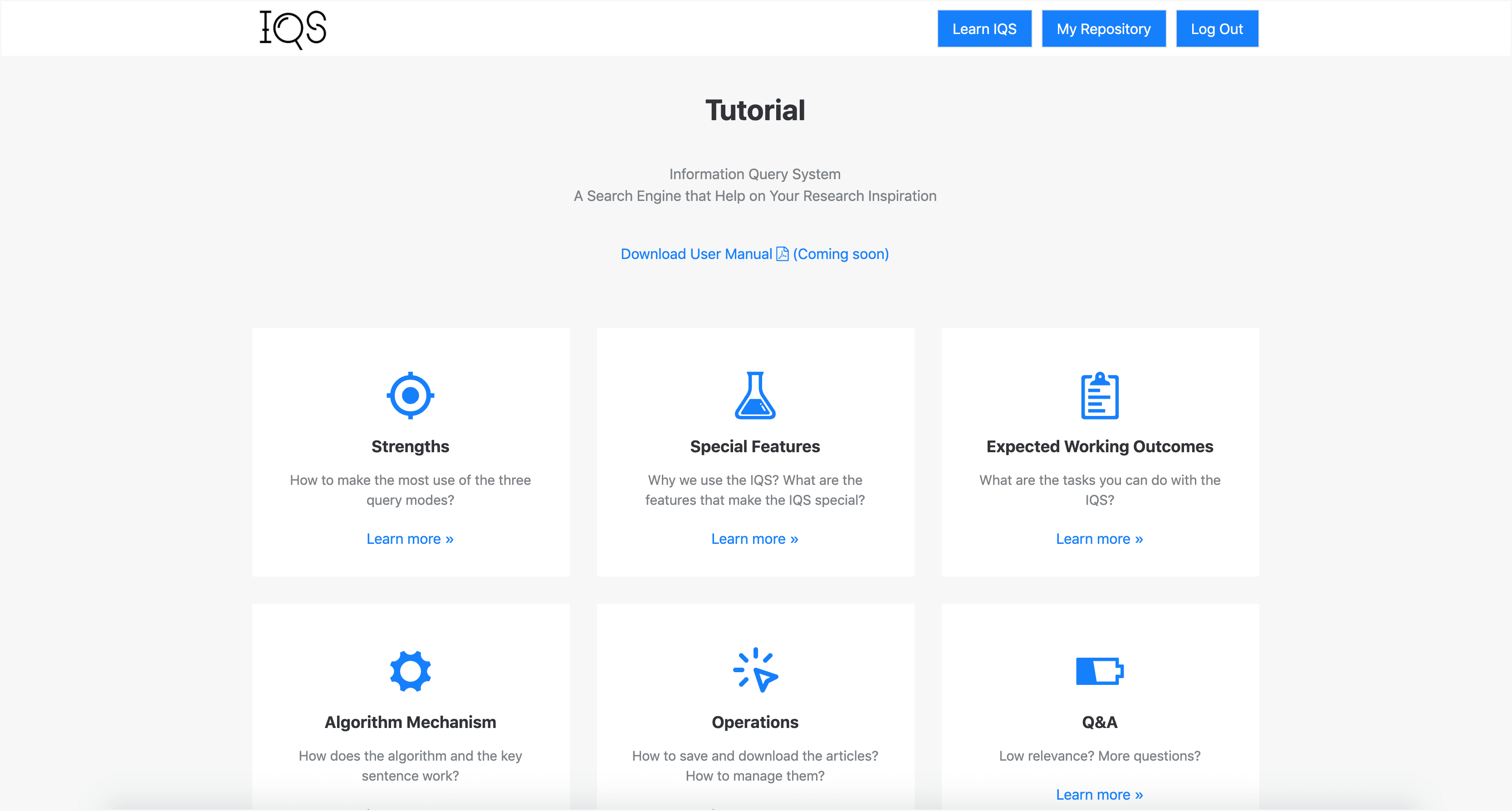
Landing page
Searching page
Q&A page
Q&A details
Exploratory Research: prototype 2
Lab Evaluation: Semi-structured Interview
Aim
Collect factual experiences as exploratory data
Data Analysis
Thematic coding (open coding + focused coding)
Steps
Semi-structured interview: facts, attitudes, reasonings, and opinions
Exit interview: questions and snow ball recruitment
Finding 1
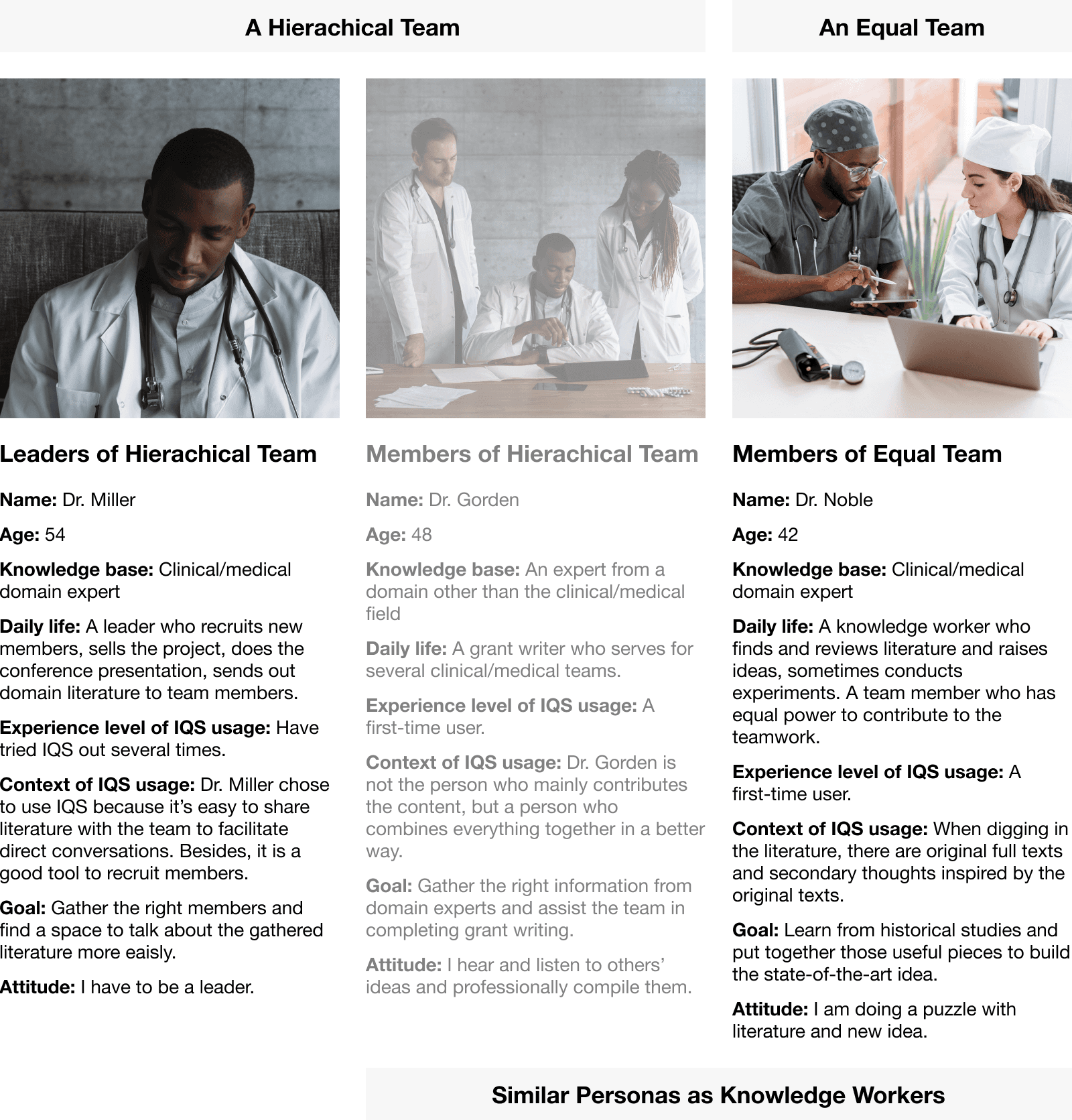
Categorization of tea-sonas and personas. There two types of teams and two types of members.
Finding 2
The tea-sona and personas that help me understand the users.
Finding 3
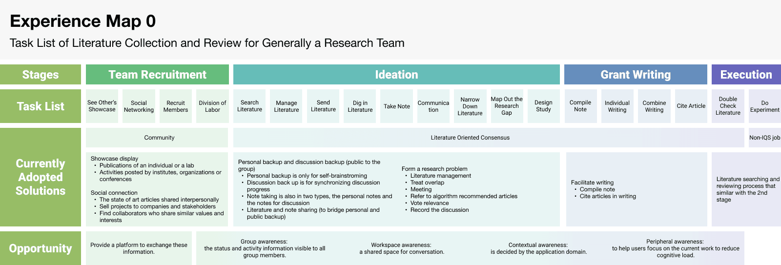
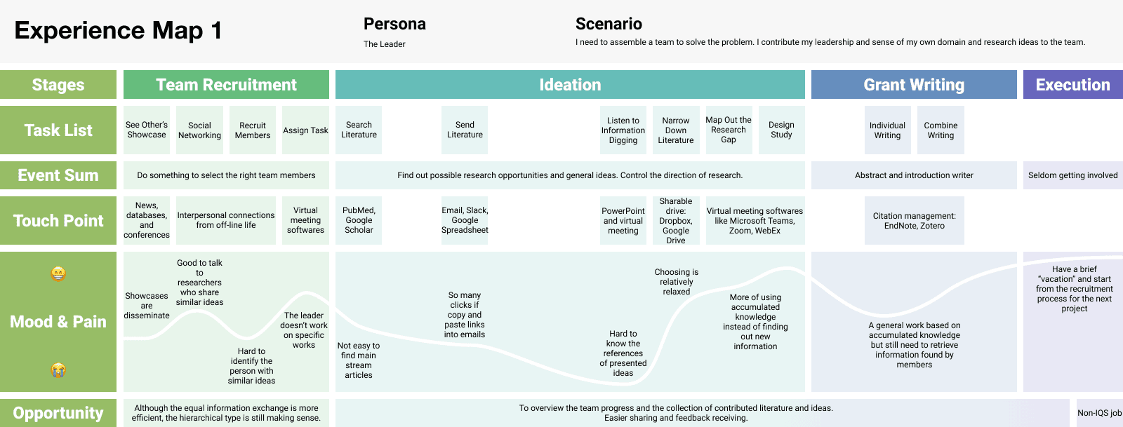
Experience maps that help to see the big picture of the current activities the users do and find out opportunities.
Finding 4
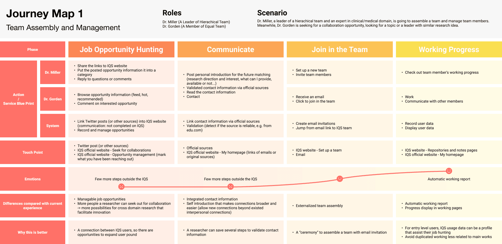
Journey map that mapping out the design ideas.
Future Direction & Limitation
How might I Do Better?
Limitation
Recruitment
The number of male participant is way more than female participants, researchers could recruit more female participants in the future.
Our research only selected a small sample size, covering 85% problems. In the future, researcher can expand the sample size to see if the conclusions is generalizable enough.
Design of Background Survey
There might be misunderstandings of the qualification question since the sample size is small, we didn't had a pilot test to verify the understandability of the survey (N=10 or 12).
Balance the Time and Resource
I had only two rounds of prototyping-evaluation, researchers can have more in the future.
Marketing Consideration
This project stemmed from the research silo, but it will be better if I have data to consider marketing related factors.
Future Direction (Research)
The Tension Between Individual Contribution and Team Efficiency
There are 2 factors that lowered the efficiency of the IQS system: redundancy of articles and visibility of novel articles. Besides, the individual's efficiency isn't necessarily guarantees the team work efficiency. Studying on these topics will not be done without testing on a programmed CIS system.
High Learning Cost of Using CIS Systems
There's no consensus design pattern among CIS product design, which added cognitive burden to onboard new users. Need to propose or adopt some design patterns to help.
Reflection on Heuristic Evaluation Criteria
The heuristic evaluation criteria was established since 1990, and was revisited in 2007. However, the internet world has evolved much since then. Researchers can try evolving the heuristic evaluation criteria too.
Future Direction (Project)
Visual Based Communication
E.g. how might we communication the protein structure.
Future Collaborative Functions
There's an opportunity to break the walls among research domains: to search by topic cross research silos, and make manual data mining open sourced.
Data visibility
Data privacy and transparency: researchers need to keep some data to themselves before publication, and keep them visible to the public after publication. How might we make sure researchers change the visibility in the right time?
My Reflections
Web Design Size
I used 1680px * 1050px as the size to design the IQS website. This was just because the convenience that I can preview the design easily on my own screen. The ideal size would be 1920px * 1080px, and then make it responsive to other sizes. And since IQS is mainly used via desktop, I haven't make it responsible to smaller screens like smart phones.
I learned to code!
I used Bootstrap Studio to make the prototypes, which is a graphical editor but can be exported as codes. I used some prepared components and edited them on canvas, however, I can also assign class names and property names to elements and control them with the CSS and HTML code.
When the resource is limited, internal critiques can diminish the necessity of conducting formal and stringent studies
E.g. the heuristic evaluation done by design experts are good enough to uncover essential usability issues, so that user participants won't feel too confused or to spend too much time critiquing the same problem.
© Fangyu Zhou 2024 Selection · All Rights Reserved

